Quant UX Interview "Portfolio" Presentations: Recommendation

A reader recently asked me for advice on putting together a Quant UX portfolio. That sparked me to reflect on presentations that are part of a hiring interview process.
I'm talking about research presentations that are often confused with "portfolios". They are different from actual "portfolios" that compile many projects and that live online. I doubt whether those are valuable for general tech job applicants (who would look at them?) and in any case, they are different.
However, a presentation as described here could be a key building block in a complete portfolio (if you decide you need one).
Over the years as a hiring manager and interviewer, I've sat through perhaps 150 interview candidate presentations. I've also observed 1000s of industry research presentations — and of course I've been on the other side as a job candidate. Here are my reflections.
The short version is this: a UX research presentation should demonstrate how you have defined and answered an interesting research question. I emphasize "presentation", "defined", "answered", and "interesting". The presentation is about research impact and engagement, not about technical proficiency. In this post, I describe the pieces to deliver that.
An event shorter version is this: are you genuinely enthusiastic about the research you're presenting? If so, that is the best presentation!
It's a Presentation, not a "Portfolio"
The term "portfolio" is sometimes misleadingly used to refer to a presentation. It implies that a company wants you to compile an array of materials that describe the range of one's expertise and experience.
That has never been the case anywhere I have worked and hired candidates. Instead, what the hiring team really wants is a clear presentation of research. It should be an example of what they might expect from you, if you're hired.
My recommendation is to plan to present 1 case study ... and to have a 2nd case study as a backup. Almost always I find that the 1st case leads to plenty of questions and discussion, but occasionally it doesn't. I have never — not once in 20+ years — observed a need for more than 2 case studies.
I illustrate my points using slides from my own most recent job presentation (in early 2022, when I applied for my current job). I don't claim that my slides are awesome or that they are a model ... all I claim is that (a) they illustrate my points, and (b) they helped me land my job (and a quite similar approach helped land my previous job).
Throughout, I encourage you to focus on UX — user / customer experience — more than any "Quant" aspect. Impress the audience with what you have to contribute to product research, which is built on, but goes beyond, quant technical expertise.
The Audience has Broad, not Specific Expertise
Approach a research presentation just like you would in a typical stakeholder meeting with intelligent and interested colleagues who are not researchers — or, if they are researchers, who are not experts in your research area.
At companies like Google, Microsoft, and Amazon, candidates often assume that the interviewers are super-intelligent beings who will know and probe everything. That is not the case!
A better assumption is that interviewers are very smart colleagues who have a different specialization than yours. They will catch on quickly and ask great questions — and they will immediately sense when you are bluffing — but they also need to be given grounding in your area. If you're an academic, think of them as quick-minded professors from different but related departments.
Explain the basics briefly and prepare to take questions, but don't talk down to the audience. Don't assume that they are experts in your methods or that they want detailed technical explanations (they'll ask if they do). Minimize assumptions and jargon.
Here's how I introduced the topic in my own portfolio with two slides. You'll notice that they are very simple — they highlight key points I made verbally.
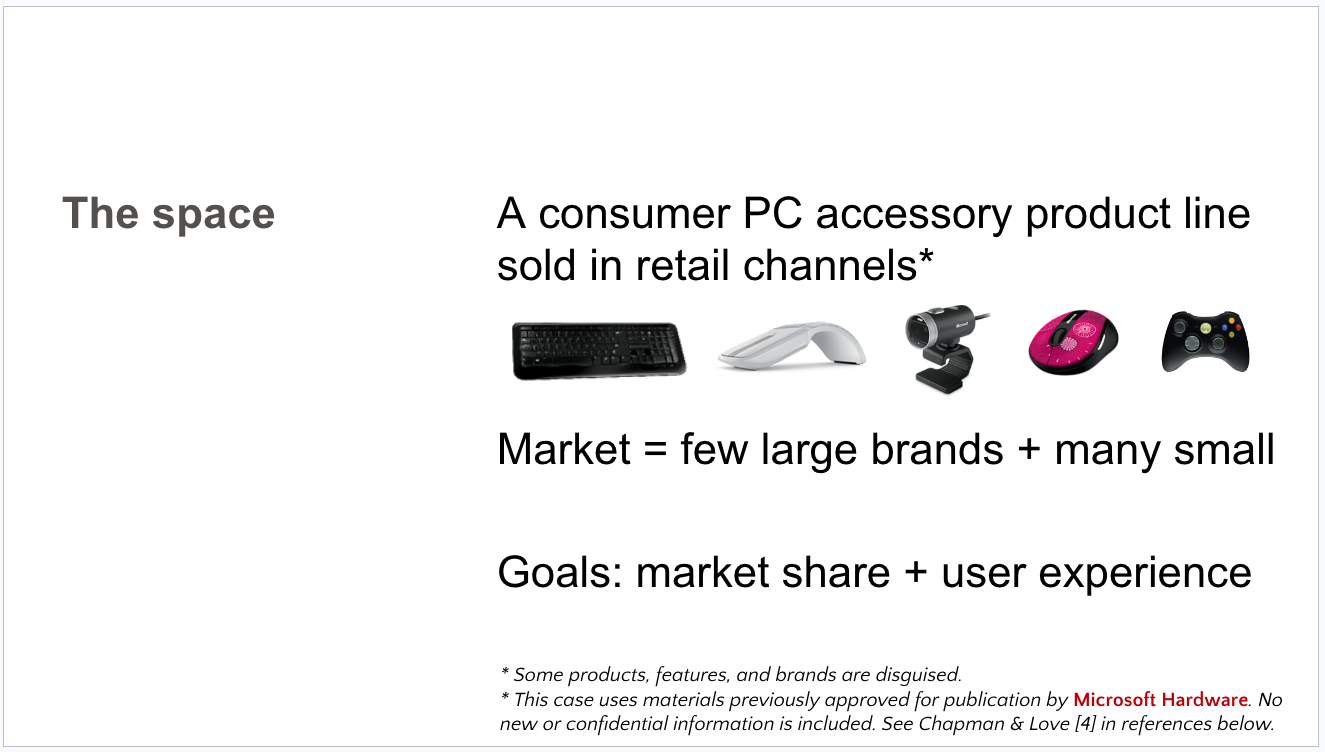
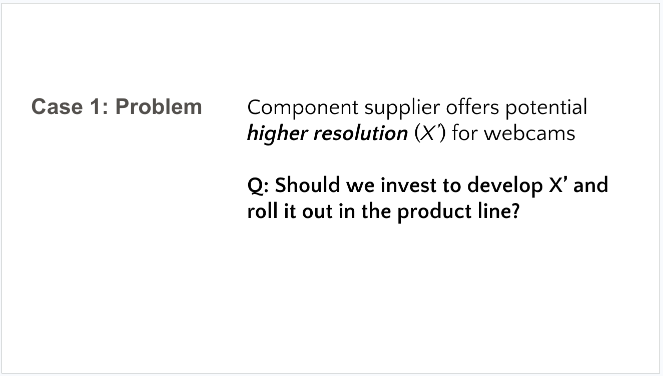
With this kind of framing, the audience knows what I'm going to talk about, and they are immediately focused on a problem statement ... as I discuss in the next section.
Have a Narrative Story with a Dilemma
This is the most important point: your case should have a narrative arc that explains why you did the research — from a business or product point of view — and how it influenced some action.
A good way to frame the arc is with a dilemma that gets resolved. For example:
We needed to change X, but users wanted Y. Here's how research led to a good compromise.
The team was pushing A and yet initial tests suggested that users hated A. Here's how research cleared up the situation.
Our business wanted to expand in B, but the direction was unclear. Here's how research recommended a direction and how it turned out.
Remember that the audience are not specialists in your method. That means that the dilemma should involve the business and customers, not just research. For instance, it is not interesting to present, "Technical method A says X but technical method B says Y. I developed technical method C to resolve them." That is uninteresting to anyone except you and a small number of fellow researchers ... unless it connects very clearly to a customer or business problem.
Following the 2 slides above, here's how I laid out a specific dilemma:
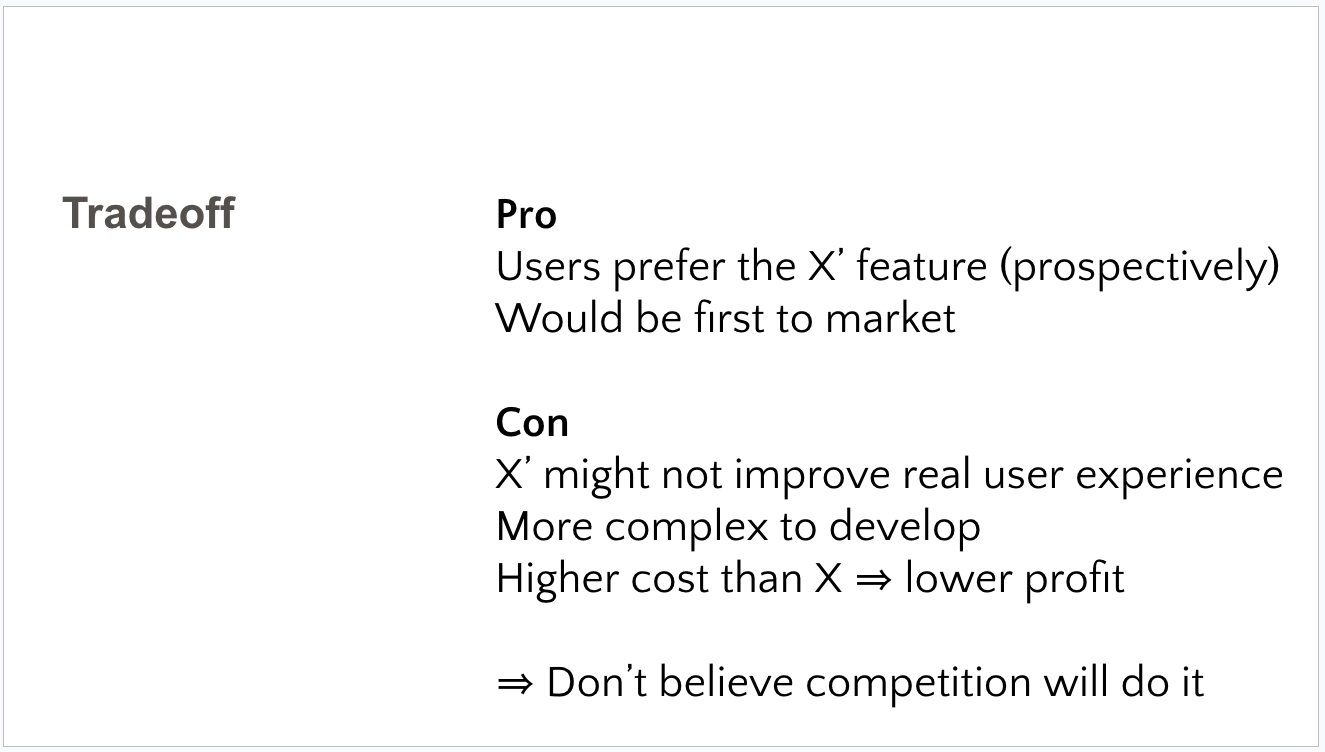
Notice that I focus on a tradeoff involving both customers and the business — and again, it is simple and approachable for any intelligent audience.
A research presentation is a job sample and — as shown in my slide above — it should demonstrate the following two crucial skills for UX researchers:
Focusing on the customer / user
Presenting research clearly to colleagues
To be clear, I do not advocate "story telling" in the senses of inventing anything, including artificial drama, sprucing up a presentation with extraneous content or images, or anything like that.
Rather, a presentation should be clear and decision-focused. Clearly focusing ona customer & business dilemma helps to accomplish that.
Minimize What You Say About Yourself
Too many candidates present multiple slides that detail their academic background, previous work experience, projects they've done, and sometimes things like their hobbies, places of residence, and families.
I suggest having only 1 screen about yourself and omit anything that is not particularly relevant or that appears on a resume (such academic background), or is extraneous to the job (such as family and hobbies).
In my most recent portfolio, I did not mention my previous jobs (see resume!) or academic credentials (again, see resume!). Instead, I had one slide about myself ... and it framed how I view the landscape of user research, along with some things I've done:
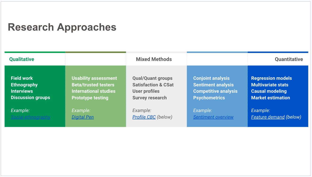
Why did I use the 1 slide about "me" in this way? Because:
This framing lets me share my "philosophy" of end-to-end research
It shows that my focus is not on "me" but on how I approach research
But is also highlights specific experience and competence
It lets me link my research philosophy to the case studies I'll present
I then promised a deep dive into two areas ... which shows how and why the framing of this slide "about me" is more directly relevant to my research as such:
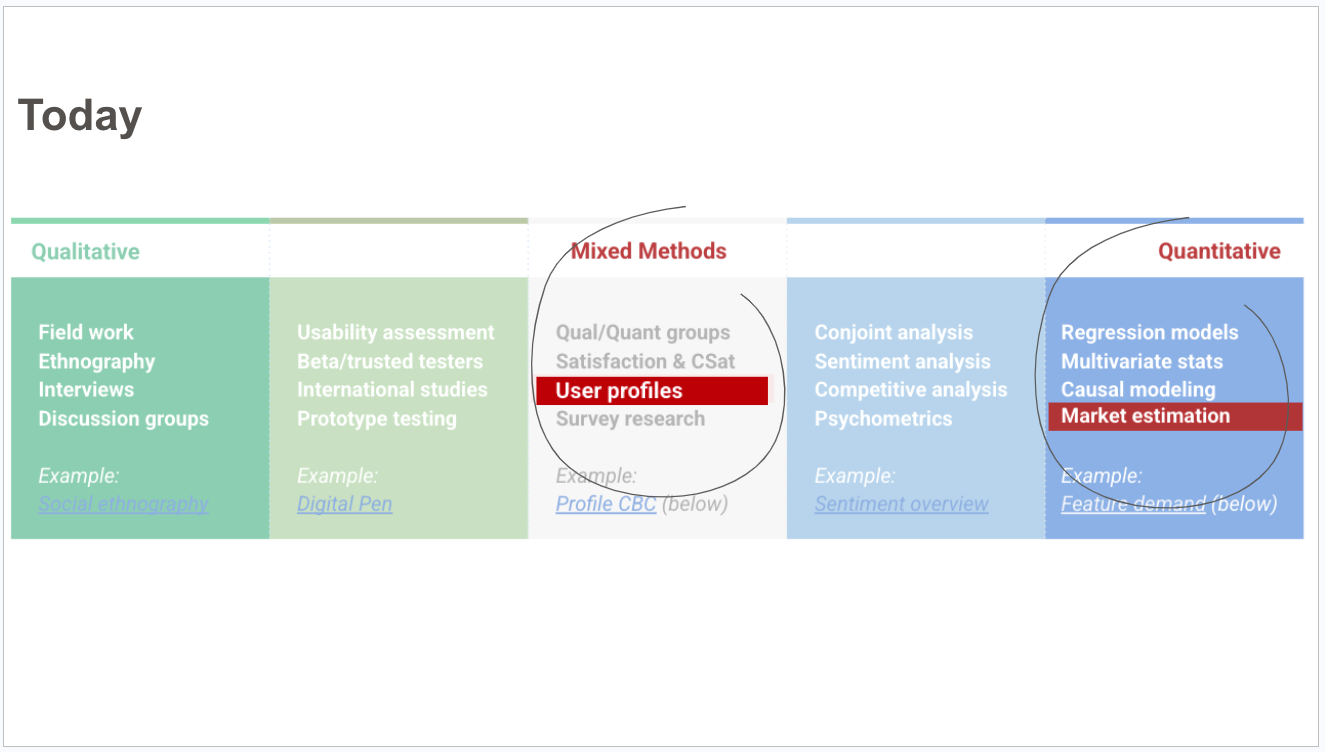
It also implicitly communicates, "I'm showing 2 things but I do much more."
Don't Include Confidential Information
A common — and in my opinion, serious — mistake is to include information that is confidential to your current or previous employer.
I've repeatedly seen candidates who present information including:
Screen mockups and images of unreleased products
Photos of customers and/or team members
Names of customers and/or team members
Statistical analyses of user needs, product behaviors, purchases, willingness to pay, etc., that come from internal, confidential data
Internal data about finances, sales, staffing, or other business metrics
There are two problems with presenting such confidential information. First, it violates your employment agreement ... and the interviewing company will wonder whether you will do the same thing with them! Second, it demonstrates a lack of attention or competence with a core professional skill for UX researchers: ethical research.
But wait?! What can you show if you can't show actual results? Your audience will understand and appreciate the need for confidentiality. It is OK to have blurred images, hypothetical screen mock ups, similar but disguised products, stock photos of users, and altered statistics that communicate a parallel result.
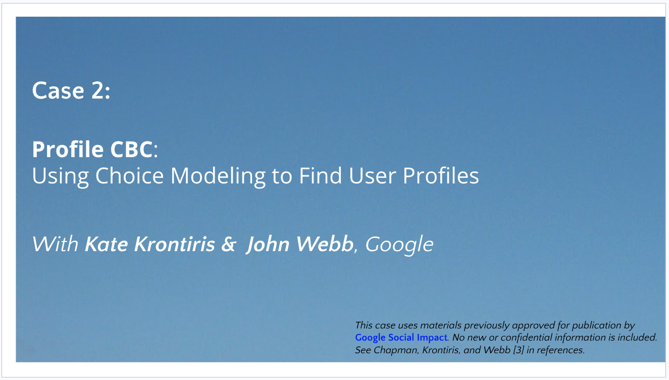
Even better, if you get approval to publish research periodically in your career, you'll have a collection that is perfectly OK to share. That's not required but is nice when it occurs. Following is an example from my presentation (a similar example is shown in the Case 1 intro above). This slide also shows how to credit colleagues.
Resolve the Narrative Arc with a Decision and Impact
Every good story needs a clear resolution. Your case study should start with a clear dilemma or decision to be made, as noted above. Then you should end with a resolution of that dilemma.
I'm not going to recap my entire presentation, but I will skip ahead to the key research result for Case #1. I used game theory + conjoint analysis to answer the question, and presented the final result like this (after walking through the pieces):
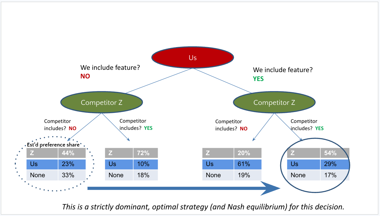
You'll notice that this slide is technical but also quite approachable (especially after building up some of the components, which I did in previous slides). At the same time it is not particularly complex. The goal is to be clear and convincing, including only what is needed to get the point across. That has the nice side effect of making the audience feel smarter (which will make them like you!)
That slide directly answers the dilemma that I started with — "yes, we should invest in developing the new feature" — and it set up the next slide about research impact:
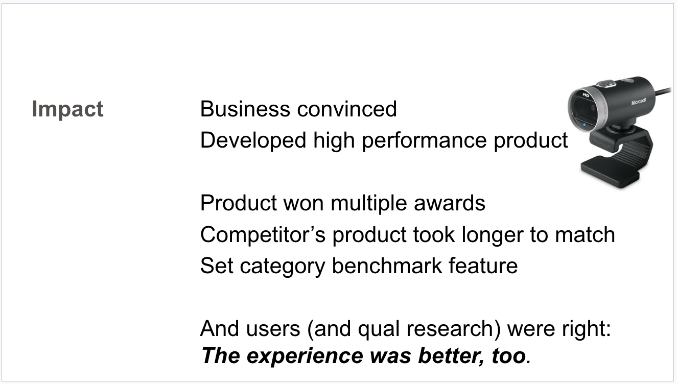
Notice again that I focused clearly on the business and the customers. And I also worked in a not-so-subtle plug for listening to users through research!
For More
Do you want to see my complete job presentation? I presented it live at Quant UX Con 2022 (after my interview) and the complete PDF is here.
Does something here worry you, because you didn't "get it right" in a recent presentation? No one ever gets these things completely right for one simple reason: a portfolio review is an interactive presentation ... and the other side is 50% of the equation. But that side is unknowable in advance.
Sometimes the interviewers are awesome (cue: the colleagues who interviewed me at Microsoft, Google, and Amazon). But sometimes interviewers are jerks (stories I've heard) — and really, it's better to find that out before taking a job. Don't worry about it! Just update your expectations and improve your presentation for the next round.
I hope something here will be useful for you in putting together a Quant UX research presentation. Thanks for reading!


