There's No Magic Bullet

Stakeholders often ask me questions that are variations of this pattern: "what's the effect of ___ on ___ ?"
For example:
If we ship this design, will the product be more appealing? (design → appeal)
If we add this feature, will customers be more delighted? (feature → delight)
If we target this segment, will we sell more products? (targeting → sales)
If we increase prices, will we make more money? (price → profit)
Sometimes I answer these by pointing out the difficulty of causal analysis. We can't run randomized experiments for such questions ... and although there are methods that may help — such as causal modeling via propensity scoring + matched sampling — those method typically involve assumptions that can't be met, or require sample sizes that are not feasible.
The underlying problem is that stakeholders often jump from a fact to an implication. Effects such as the above are facts; product decisions do lead to tangible outcomes and there are implications like those listed above. However, that does not imply that we can successfully measure them.
Here, instead of going into why correlation isn't causation, or why causal modeling is not a panacea, I share another approach that I take to deconstruct such requests: depicting and discussing the underlying situation.
The Underlying Situation
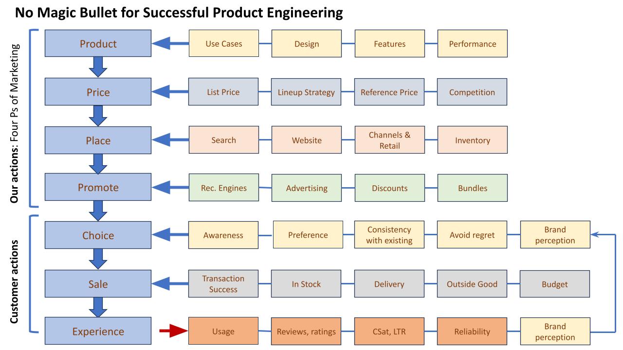
I'll start with a chart that might communicate the entire message:

This is a general schematic and not "the answer". One could go through the items and flow and then agree, disagree, reorder, restate, add, or delete various boxes. You might replace the "4 Ps" with some other framework. Such changes are all OK.
Whether you agree with the details or not, the key point of the chart is this: successful products require simultaneously successful execution of dozens of crucial areas. A failure in any one of the boxes above can ruin a product, its customer experience, or a business.
That implies a corollary: success in any single box, or a subset of boxes, or a single row, or a subset of rows is not enough. Success in any one area doesn't imply a successful outcome. In fact, if you look at the chart again, you'll see that there is not any single outcome in it (see my criticism of "North Star" metrics). There is a set of outcomes that feed into future cycles, mediated in large part by brand perception.
Some Implications
Discussion of how to create and assess "successful products" might require slightly more than one blog post but I'll unpack four key implications of my view here:
Answering a question like "what's the effect of ___ on ___ ?" usually requires more effort than it is worth. Forget about the rare exception.
→ Instead: focus on good assessment within each box — assessing users' experiences, assessing behaviors, assessing product quality, assessing prices, assessing competitors, and so forth — and don't try to link them together (which, even if you did, would necessitate good assessment within each box anyway; in fact, it would require great assessment to handle the pooled variance and confounds.)
The business goal is not to search for a magic bullet that connects [some decision] and [great outcome]. It is unreasonable to expect to find one.
→ Instead: execute reasonably well across the board and then identify the points for unique value add from your competencies.
Increasingly, I believe businesses and products fail because they forget the basics. At least in Tech, too many teams try to create the "the next big thing." That loses sight of two facts: (a) most "big things" are surprises to their creators, and (b) most businesses do fine without a "big thing." (FWIW, I think this tendency is related to promotion-driven development, but that's another topic.)
Put differently, a well-crafted product that meets the needs of paying customers already is a "big thing." Don't mess it up.
Research (and this is true of other disciplines) needs to mix breadth and depth — breadth across a large landscape of assessment, as outlined above, plus depth to do it well.
→ In the Quant UX book, we talked about breadth and depth in terms of individual researchers' skills ... and the concept applies just as much to research teams and to companies as a whole.
The landscape of "boxes" in the chart above can be used to plan holistic research. I often create such charts of all the areas we might want to know about, and then prioritize research activities. As a general matter, I prefer to distribute somewhat "superficial" research across much of the landscape of questions to get an impression of where problems are. Then target depth research where there are customer problems (or opportunities).
→*This doesn't mean that UX researchers should try to cover everything in the chart. For example, I don't think UXRs are the right folks to assess advertising, channel promotions, or various other things. However, *UXRs are the right folks to consider the big picture of a product and its overall, end-to-end experience and help coordinate with other teams about what the business knows.
Conclusion
Great product teams — and good product teams, which TBH are good enough! — require successful execution of many things. In any competitive business, success is not guaranteed, and is not easy ... or if it has been easy, then it's random and not replicable. Instead of expecting a magic bullet or a path to a "North Star" we should expect to do real work and execute well on many things at once.
And do you know what the good news is? Executing well — and, for researchers, learning about many different aspects of the products and customers — is rewarding on its own.
Finally, I'll say this: If running a business is drudgery — such that an executive is looking for a shortcut and a magic way to implement change — then the change needed is theirs ... they should do something else. Meanwhile, I have customers to talk to.
Finally, here's the one-chart summary again. Cheers!


