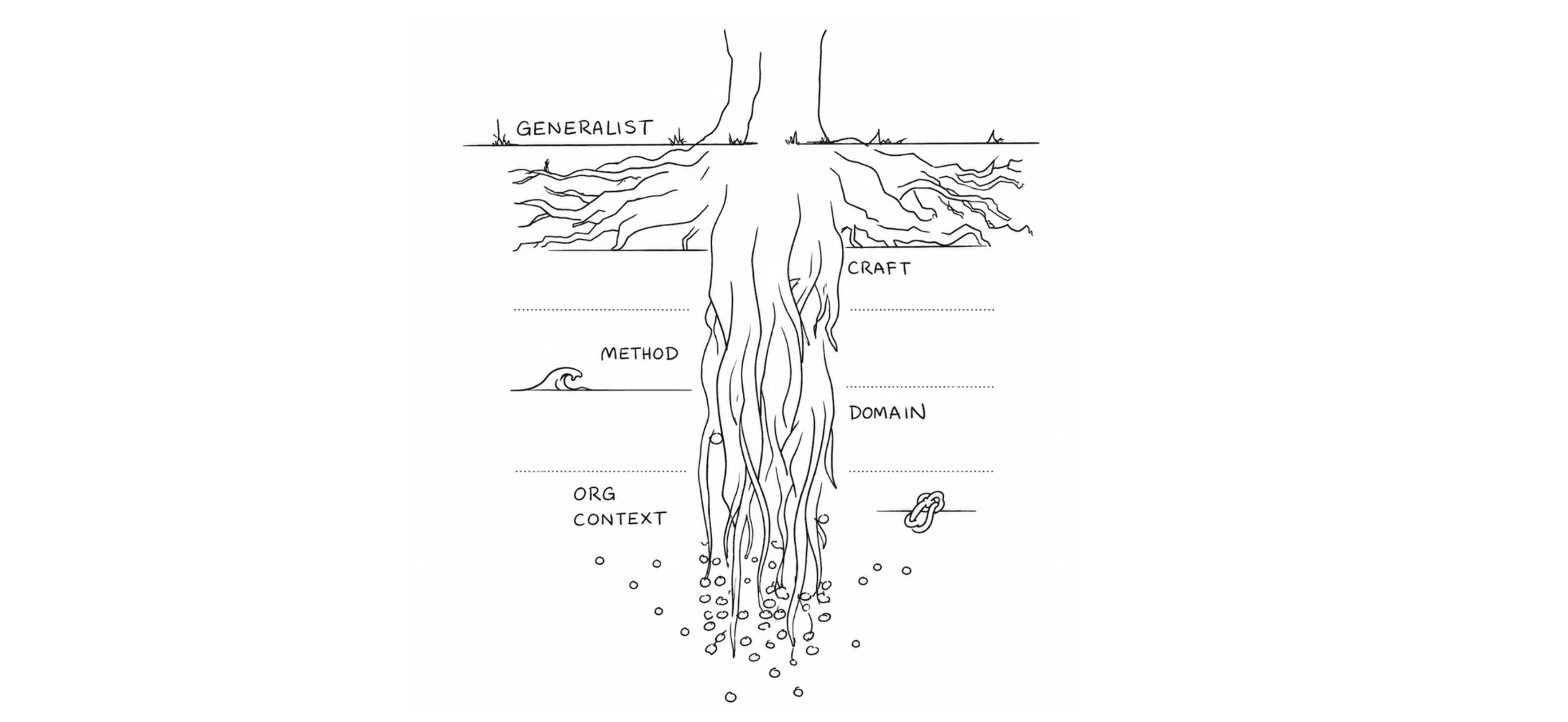
North Star ... a path to being lost

Many Quant UX researchers are confronted with defining, measuring, or otherwise responding to "North Star" business metrics.
A North Star metric is supposed to express a single, simple goal that will unify a business to operate in a coherent direction. The term emerged sometime in the 2010s in Silicon Valley companies. It was widely promoted by Sean Ellis, who wrote in Growth Hackers in 2017:
The North Star Metric is the single metric that best captures the core value that your product delivers to customers. Optimizing your efforts to grow this metric is key to driving sustainable growth across your full customer base. [Sean Ellis]
Long-time readers of this blog should be able to identify one problem already. It purports to drive sustainable growth and identifying one's "full customer base" ... but that claim requires evidence from the future. How could a newly adopted metric — and one first promoted in 2017 — predict the long-term future? (This is an example of magical thinking; not much more needs to be said about that, IMO.)
In the rest of this post, I'll describe the more general and less magical reasons that I believe North Star metrics are misguided and harmful.
Problem 1a: Businesses are Not Unidimensional
Some years ago — the exact company/product doesn't matter — I had a discussion about the product strategy with one of the directors. I asked:
There are many potential goals for us: product quality, use case coverage, completeness, simplicity, market share, user satisfaction, revenue, profit, thought leadership, adoption rate, reliability ... and some of those pull in different directions, such as revenue vs. adoption rate. Which ones are most important? [me]
The answer I received was, "Nobody knows." And more specifically, I was told that different leaders had different goals.
North Star metric proponents would say that is a good setup for using a north star approach: to reconcile the different directions and confusion by unifying on one goal.
However, that doesn't really solve the problem. It simply ignores it! The fact is that businesses do have multiple important goals, and they do not all pull in the same direction. In sections below, we'll see an example with more discussion.
The job of management is not to pretend otherwise but to acknowledge the tradeoffs and to handle multiple — and sometimes conflicting — information and goals in a dynamic way. A better answer to my question would have been something like the following (I'm inventing this part):
In the short term we are prioritizing three things: use case coverage, product quality, and user retention. For the next year we do not have to worry about revenue or profit, but on a three year horizon those will become important. [me]
That is a clear and actionable set of goals that ties a market entry strategy to a well-specified set of implicit metrics.
Problem 1b: Tradeoffs are Essential in Business
Closely related to the problem above, we cannot pretend that tradeoffs don't exist in business. A quote attributed to Benjamin Franklin puts it as in the caption of the following meme (template by Stephanie Godbout) :

In this meme, the tradeoff is between adoption and initial user satisfaction (driven by low prices) as opposed to product quality and long-term user satisfaction.
The job of management — and product design, and engineering — is to make such tradeoffs in regards to user needs, a business strategy, and market opportunities.
Problem 1c: You Knew There Would be Code!
This is a quant blog so ... wait for it ... I have R code to demonstrate the concept! (You can copy/paste using the icon on the upper right in each block; or see the end of the post for all the code in a single chunk.)
Let's imagine we have a product line — perhaps smartphones or purses or computer monitors or high-end wines — whose prices might range $79-999. We set a random seed (used below) and assign price points:
# make randomization-repeatable fake data
set.seed(98245)
# price series for hypothetical product space (phones, purses, tvs, etc)
price    <- seq(from=79, to=999, by=10)
Demand for any product — assuming everything else is constant — decreases as price goes up. (You might say, "but what about luxury brands?" The answer is that people like price discounts on luxury brands, too; a sale is always good, if everything else is exactly constant.)
We add a demand variable inverse to price:
# demand vs. price
# demand is inverse of price (could also use log(price), etc)
demand   <- jitter(100/price, factor=10)
Plotting those:
library(ggplot2)
ggplot(aes(x=price, y=demand), data=data.frame(demand, price)) +
  stat_smooth() +
  ggtitle("Demand vs Price (hypothetical)")
We get the following:
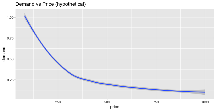
Nothing much to say, so far. Now let's add revenue as the function of demand and price, and plot that:
# revenue
revenue  <- demand * price
ggplot(aes(x=price, y=revenue), data=data.frame(revenue, price)) +
  stat_smooth() +
  ggtitle("Revenue vs Price (hypothetical)")
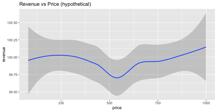
This flat curve might surprise slightly but is implicit in the demand math. To put it differently, a good business could (in theory) exist at any reasonable price point.
Now suppose that customers are happier, in general, with higher-priced products. That's a reasonable assumption; all else being equal, a higher-priced product should be able to deliver more value.
We add CSat positively associated with price, with some random noise (jitter()) and fit onto a 5 point scale (using cut()):
# csat vs. price
# random 1-5 scale csat that generally increases with price
csat     <- as.numeric(cut(jitter(price, factor=600), 5))
ggplot(aes(x=price, y=csat), data=data.frame(csat, price)) +
  stat_smooth() +
  ggtitle("CSat vs Price (hypothetical)")
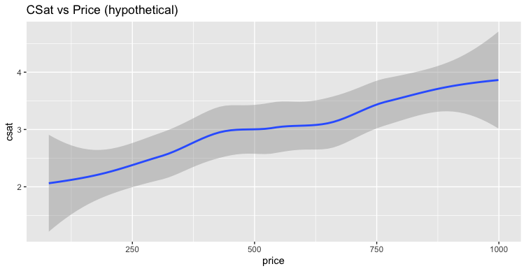
As we coded, the plot shows hypothetical data for CSat going up with price.
As an aside, I don't advocate treating CSat as a continuous variable, as is implicit here by using the stat_smooth() function. CSat on a 5-point scale is an ordinal variable. However, it can be helpful to pretend it is continuous in simple discussions like this; see Chapter 8 of the Quant UX book for more.
To recap, our data include price, demand, and csat with some reasonable albeit naive associations. We have not yet looked at demand vs. csat. The following plots those, using jitter() to make csat more quasi-continuous (see the disclaimer above; this is for quick exploratory purposes):
# demand vs. csat
# jitter x axis b/c csat is ordinal, helps with fitting line
ggplot(aes(y=demand, x=csat), data=data.frame(csat=jitter(csat), demand)) +
  stat_smooth() +
  xlab("csat") +
  ggtitle("Demand vs CSat (hypothetical)")
Now we see a perhaps surprising implication of our reasonable data:
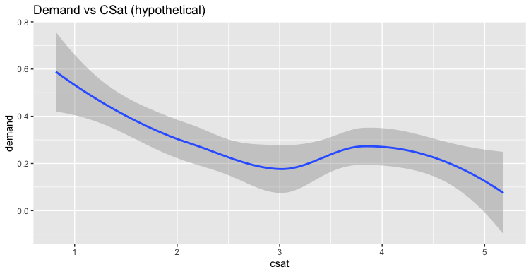
Using our assumptions, demand is lowest for the most-satisfying products. And then we look at revenue vs csat:
# revenue vs. csat
ggplot(aes(y=revenue, x=csat), data=data.frame(csat=jitter(csat), revenue)) +
  stat_smooth() +
  xlab("csat") +
  ggtitle("Revenue vs. CSat (hypothetical)")
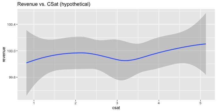
Revenue doesn't change with CSat (in these hypothetical albeit perhaps plausible, data). Although this plot is algebraically straightforward, it nevertheless surprises me every time I think about it. We cannot expect everything "good" to align all at once.
What does all of this mean for North Star metrics? We can pick any single metric to optimize, but focusing on a single metric may lead to no change or a negative change in other aspects of our business.
You may decide that you don't care about those things — that your business will be fine if revenue is flat, or demand drops, or users are dissatisfied — but I wouldn't advise anyone to make that bet. Important metrics do not all move in the same direction, at the same time; there are inherent tensions. (If there weren't tradeoffs to be made, why would we need executive management?)
It is not difficult to track a few metrics and make sure that you are not driving the business off a cliff by excessively focusing on one metric that works against others.
To be clear, I'm not advocating tracking or trying to make decisions based on 20 metrics (or 50 or 100). But we can use more than 1.
Problem 2: North Stars Promote Misguided Expectations
North Star proponents may rebut the point above, saying, "Of course you should track multiple metrics, but it is still helpful to focus on a single one to align the team."
The problem with this is that focusing on one metric inherently devalues others. And, perhaps even worse, it causes people to assume that all metrics will improve together.
In my experience, it's common for folks in product development to believe something like the following:
If we make a great product, users will be happy
If users are happy, they will buy more from us
If they buy more from us, we will gain market share
If we gain market share, it will improve our brand perception
If our brand perception improves, we can charge more for products
If we charge more, we will make more profit
If we make more profit, we can make better products
Go to step 1 and repeat, as a virtuous cycle
That's a great story and very appealing to believe (the psychologist in me says, "ego-syntonic") ... and there is some degree of truth in each of the implications. But this is a longitudinal story over time, and all of those things cannot operate together at one time. Each of them also has a correlation less than 1.0; they are probabilistic at best.
Unfortunately by focusing on a single North Star, employees may assume that everything will improve, everywhere, all at once. Or to assume that it doesn't matter if some metrics — that you don't even track, because "north star" — get worse.
Is ignorance a roadmap to growth hacking? I wouldn't bet on it!
Problem 3: Good Employees See Through Simplistic Frameworks
I won't spend much time on this problem, as the title says it all. If you hire smart people, they will realize that focusing on a single metric is naive. That will lead them variously to do things like:
Roll their eyes and ignore management
Game the system to drive up the one metric (see Goodhart's Law)
Stand up to challenge the assumptions, and get knocked down as troublemakers
I hate to see any of those outcomes.
Instead
The idea of a North Star alludes to celestial navigation ... and if we consider actual navigation for a moment, then the better path is clear: use multiple signals.
At the simplest, most literal level — i.e., navigation — if you point at the North Star you will not know where you are. You know where you are pointing (your bearing), but you don't actually know where you are, or where you are going along the way! Celestial navigation requires more than one reading of time, distance, or bearings to establish triangulated — multiple metric — wayfinding. (See the history of the Longitude Prize for navigation, which led to the invention of reliable clocks.)
Using multiple signals does not have to be complicated, and it does not mean to track "everything". The key is to have a small number of metrics that give greater insight. That will diminish the risk of missing something crucial (such as declining revenue, quality, demand, brand perception, or user satisfaction).
Using a few metrics — besides being a more accurate representation of business — brings three other benefits:
if any of those stars wavers, you will have data to assess the risk and debug what is happening.
if conditions change — either in the market or in your strategy — you'll have data you need to make a faster, more informed decision
employees won't feel insulted by pretending things are unidimensional
Finally
From a UX perspective, I think a good place to start is with the HEART UX metrics, as Kerry Rodden and I outline in Chapter 7 of the Quant UX Book (or see here). The HEART metrics apply to UX and do not include not everything needed for a business ... but they are a great place to start.
A nice thing about HEART is that its metrics come from different sources and methods, reducing the risk of getting an overall incorrect signal. The HEART framework also explicitly proposes that any single metric is an uncertain and only approximate signal of an ultimate product goal that is not, in itself, directly measurable.
As promised, following is all of the R code used in this post. I use R as a kind of "sketch book" to demonstrate data and ideas. As discussed above, even simple assumptions may lead to surprising outcomes!
# north star blog post
# chris chapman, january 2024, https://quantuxblog.com

# make randomization-repeatable fake data
set.seed(98245)
# price series for hypothetical product space (phones, purses, tvs, etc)
price    <- seq(from=79, to=999, by=10)

# demand vs. price
# demand is inverse of price (could also use log(price), etc)
demand   <- jitter(100/price, factor=10)
library(ggplot2)
ggplot(aes(x=price, y=demand), data=data.frame(demand, price)) +
  stat_smooth() +
  ggtitle("Demand vs Price (hypothetical)")

# revenue
revenue  <- demand * price
ggplot(aes(x=price, y=revenue), data=data.frame(revenue, price)) +
  stat_smooth() +
  ggtitle("Revenue vs Price (hypothetical)")

# csat vs. price
# random 1-5 scale csat that generally increases with price
csat     <- as.numeric(cut(jitter(price, factor=600), 5))
ggplot(aes(x=price, y=csat), data=data.frame(csat, price)) +
  stat_smooth() +
  ggtitle("CSat vs Price (hypothetical)")

# demand vs. csat
# jitter x axis b/c csat is ordinal, helps with fitting line
ggplot(aes(y=demand, x=csat), data=data.frame(csat=jitter(csat), demand)) +
  stat_smooth() +
  xlab("csat") +
  ggtitle("Demand vs CSat (hypothetical)")

# revenue vs. csat
ggplot(aes(y=revenue, x=csat), data=data.frame(csat=jitter(csat), revenue)) +
  stat_smooth() +
  xlab("csat") +
  ggtitle("Revenue vs. CSat (hypothetical)")