Quick Review: Conference Submission Sequences
During the Call for Proposal (CFP) period, the Quant UX Conference committee tracked submissions to see how the 2024 submissions were progressing, vs. 2023 data. On the committee, we wanted to know at any given time: "How are we doing? How many total submissions can we expect?"
In this post, I share the basic submission timeline data and my R code to review it. The analysis is simple but I hope it illustrates two things: (1) even simple analyses are useful, and (2) the data suggest some general lessons.
Set Up the Data
The main question here is this: at any given point in time, how do the number and trend of submissions in 2024 compare to the prior year (2023)? To answer that, we need the count of submissions longitudinally as they are submitted.
The Quant UX Committee has made the sequence of submission dates publicly available (after removing all identifying information). We wish to share as much data as possible about the conference, to illustrate real-world analytics.
First we load the submissions sequences and review their format:
# read the two years of data
qc.23 <- read.csv(url("https://www.quantuxbook.com/misc/quxc23.csv"))
qc.24 <- read.csv(url("https://www.quantuxbook.com/misc/quxc24.csv"))
head(qc.23$x)

The dates from CSV are in raw character format, so I convert them to actual date objects (in POSIXct format). The lubridate package is great for anything related to dates and times. At the same time, I use seq_along() to add values for the sequences of events, which is also the cumulative count of submissions:
# convert dates to standard format
library(lubridate)
qc.23$Date     <- parse_date_time(qc.23$x, orders="m/d/y")
qc.23$Sequence <- seq_along(qc.23$Date)
qc.24$Date     <- parse_date_time(qc.24$x, orders="m/d/y")
qc.24$Sequence <- seq_along(qc.24$Date)
The closing dates for the CFP differed for 2023 and 2024 and it makes the most sense to align the submissions by the time before closing (instead of time from opening). We can do that by subtracting the closing date from the submission dates (I actually use the day after closing, which we need to remember below):
# align 2024 and 2023 dates based on the effective closing date
qc.23$DaysToGo <- as.Date(qc.23$Date) - as.Date("2023-02-05")
qc.24$DaysToGo <- as.Date(qc.24$Date) - as.Date("2024-01-28")
I combine the two years in a single data frame, and add the Year as a factor variable. Note that simply extracting the year from the proposal dates using year() won't work, because some proposals in each year were for a conference in the next year. Instead, I code the Year based on a break point relative to the conference date itself:
# make combo DF with both
# make combo DF with both
qc.sub      <- rbind(qc.23, qc.24)
qc.sub$Year <- factor(ifelse(qc.sub$Date > as.Date("2023-06-01"), 2024, 2023))
As always, I do a lot of checking to make sure the data look reasonable, with head(), some(), and other commands such as str(). (Your results with some() will differ because it shows random rows.)
library(car)
head(qc.sub)
some(qc.sub)
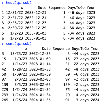
In the data, we see that the Date is correct for a given character string, DaysToGo is calculated correctly, and the Sequence is in appropriate order vs. the Date.
Descriptive stats can answer, "how many submissions arrive at the last minute?" We can answer that using quantile() to get the cumulative frequency. I add a couple of details, such as using subset() to count only the submissions added during the CFP period, and adding +1 to DaysToGo because the closing date above was actually the day after closing. (It's easier to add +1 so 0 means "last day" rather that remembering that 1 means last day.) Finally, we can get percentile deciles in 10% increments using the shorthand proportions of 1:10/10. As often, the code is much shorter than the explanation:
# quantiles by Days To Go (+1 because we offset the closing date above)
with(subset(qc.sub, DaysToGo < 1), quantile(DaysToGo + 1, pr=1:10/10))
The answer is:
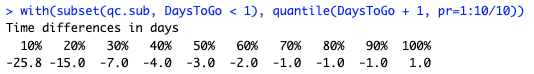
Around 35% of proposals came on the final day that the CFP was open, about 70% in the final week, and 80% in the final two weeks. (That combines both years.)
So, the data look good and we can move to the main answer: plotting them!
Compare the Sequences by Plotting
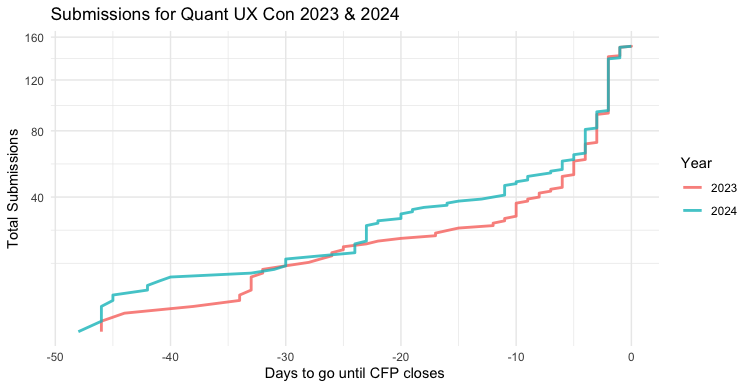
During the 2024 CFP period, every couple of weeks I would plot the incoming 2024 CFP data vs. the 2023 data. By plotting the Sequence (cumulative total) of the new data vs. the old data, by DaysToGo on the X axis, the trends would be easy to see.
Here's the code. At this point, we have complete data, but this code worked identically as the data came in, too:
library(ggplot2)
p <- ggplot(data=subset(qc.sub, DaysToGo < 1),
            aes(x=DaysToGo, y=Sequence, group=Year, color=Year)) +
  geom_line(linewidth=1, alpha=0.8) +
  theme_minimal() +
  scale_y_continuous(breaks=1:8*20) +
  xlab("Days to go until CFP closes") +
  ylab("Total Submissions") +
  ggtitle("Submissions for Quant UX Con 2023 & 2024")

p
A few minor comments about the code. I use a subset() of the data where DaysToGo < 1 because we added a few submissions to the program after the CFP closed (such as adding the keynote talk). Those would mess up the X axis. I set the line alpha=0.8 to allow slight transparency where the lines overlap. I save the chart to object p for reasons we'll see below.
Here's the resulting chart:
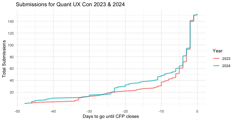
The trend was pretty clear at every point along the way! (BTW, ggplot2 warns about the X axis being a difference in times, but handles it OK. We'll solve that below.)
Next, let's look at a couple of interpretation points.
What About the Distribution Pattern?
For purposes of curiosity, we might wonder, "what kind of distribution is that?" It looks vaguely reverse-ly lognormal (or perhaps a variety of reversed zero-inflated binomial). Or perhaps it just reflects the famous log-procrastination distribution. (That's a joke.)
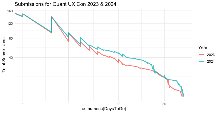
ggplot2 makes it easy to try a few different scales. However, we have DaysToGo in negative numbers ... and that won't work for log(), sqrt(), and the like. The easiest approach is simply to multiply X by -1 in our aes() call. I add as.numeric() so we can transform the values mathematically rather than treating them as times. This snippet also shows why I saved the plot object p above, so we could reuse the plot:
p + aes(x = -as.numeric(DaysToGo))
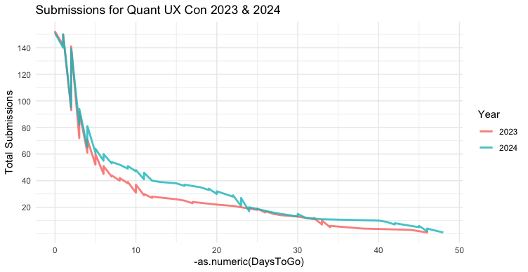
This chart is jagged because Sequence counts up along the negative timeline, but that is now reversed. That doesn't hurt out interpretation although it is unsightly. (I'll leave that as an exercise for the reader to fix! One hint: can you start each day's count where the previous day left off?)
Now that we have positive values, we try transformations such as scale_x_log10():
p + aes(x = -as.numeric(DaysToGo)) + scale_x_log10()
Interesting! Now we see that the sequence is much more approximately linear, with only a slight curve over time. (Note: log scaling gives a warning for the data points with DaysToGo==0. We can ignore that; or filter the data again.)
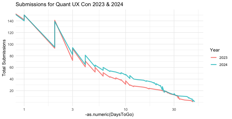
Speaking of which, curvature always suggests a square (or some other exponential) relationship for the Y axis. Let's try that (in this case, with the original plot; only the Y axis changes):
p + scale_y_sqrt()
Or we might combine them, with Y as square root and X on log scale:
p + aes(x = -as.numeric(DaysToGo)) + scale_x_log10() + scale_y_sqrt()
That is now very close to being linear in pattern. That doesn't mean that this is the right model in any way; it's just an observation. If I were interested to model such data generally, I would think about what to expect from a theoretical point of view, inspired by this observation.
The point here is this: if your data and plots are set up well, it can easy to explore distribution patterns and ask "what if?" questions about the potential distributions. That may give additional insight and prompt questions about the underlying data generation process, as part of good data exploration and theorizing.
Bonus Plot
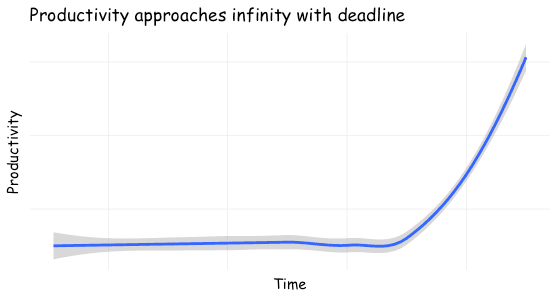
I mentioned the log-procrastination distribution above ... which will be familiar to anyone reading this blog! Here's a chart, as featured in the cover for this post:
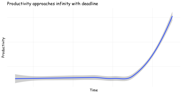
And of course, here is R code to make that chart:
timerange  <- 1:100
productive <- data.frame(Time = timerange,
                         Productivity = sapply(timerange,
                                               function (x) ifelse(x < 90, x, x + exp(x/100)^8)))

ggplot(productive, aes(x=Time, y=Productivity)) +
  stat_smooth(fullrange = TRUE) +
  theme_minimal() +
  theme(axis.text.x = element_blank(),
        axis.text.y = element_blank(),
        panel.grid.major = element_blank(),
        text = element_text(family="Comic Sans MS")) +
  ggtitle("Productivity approaches infinity with deadline")
BTW, there's nothing particularly special in the Productivity anonymous function's formula. It was the first approach that occurred to me, and I tinkered to get the look I wanted. Many exponential functions would work.
Side note: if I were doing this for most purposes, I would use a less annoying font than Comic Sans! I went with Comic here to avoid diving into alternative font setup.
Reflections and Takeaways
People procrastinate — for many reasons, some good — so the submission rate approaches infinity with a deadline.
Don't bet against the data. We had almost the exact number of submissions in 2024 as in 2023 (2024 = 151, vs 2023 = 152. Data always amaze me!)
The estimates were good all along the way. The curves had close alignment in most of their range. That reassured us on the committee as submissions arrived. I regularly reported that we were on track vs. 2023 or possibly slightly ahead.
Surprisingly, there was high consistency despite our invitations growing. Our email list grew by 42% year over year, but that had no effect on submissions.
Such comparisons assume a consistent process (aka sample). That's why I don't include the first year, 2022, when our process was quite different.
And I have a meta-takeaway: I hope this post bolsters the claim that relatively straightforward R code (or Python) is very powerful. Even simple code gives us many tools for analyses, data cleaning, and data visualization that would be almost impossible otherwise.
Pointers to More
First, I posed a "reader exercise" in the "Distribution Pattern" section above. That is an R brainteaser and is good practice for the kind of problem that arises all the time in data visualization. I recommend trying to solve it. (Like everything in R, there are several approaches and no single right answer.)
Second, to learn more about data transformations, there are general guidelines in Section 4.5.4 of the R book and the Python book.
Third, if I were looking to model such a process more formally, I would consider models for time series analysis and especially (perhaps) survival analysis. In this case, the "survival event" is when a proposal is submitted. The main analytic challenge is that these data are 100% censored; there are 0 observations of anyone not submitting a proposal. (Warning: those are deep topics and not suitable to dip in for a quick answer.) Those go far beyond the goal of this kind of data review.
Finally, if you'd like to learn more about the Quant UX Conference, which is online and low cost, see the website (we'll hope to see you in June 2024!)
Appendix: All the Code
Here is all of the R code from this post.
One thing to notice is that I did not refactor the repeated chunks of data setup code in accordance with the "don't repeat yourself" (DRY) principle. That's a long discussion; in this case it was simpler and IMO makes the code easier to read.
# quantux con submissions over time, 2023 and 2024
# for chris chapman, quantuxblog.com

# read the two years of data
qc.23 <- read.csv(url("https://www.quantuxbook.com/misc/quxc23.csv"))
qc.24 <- read.csv(url("https://www.quantuxbook.com/misc/quxc24.csv"))
head(qc.23$x)

# convert dates to standard format
library(lubridate)
qc.23$Date     <- parse_date_time(qc.23$x, orders="m/d/y")
qc.23$Sequence <- seq_along(qc.23$Date)
qc.24$Date     <- parse_date_time(qc.24$x, orders="m/d/y")
qc.24$Sequence <- seq_along(qc.24$Date)

# align 2024 and 2023 dates based on the effective closing date
qc.23$DaysToGo <- as.Date(qc.23$Date) - as.Date("2023-02-05")
qc.24$DaysToGo <- as.Date(qc.24$Date) - as.Date("2024-01-28")

# make combo DF with both
qc.sub      <- rbind(qc.23, qc.24)
qc.sub$Year <- factor(ifelse(qc.sub$Date > as.Date("2023-06-01"), 2024, 2023))

library(car)
head(qc.sub)
some(qc.sub)

# quantiles by Days To Go (+1 because we offset the closing date above)
with(subset(qc.sub, DaysToGo < 1), quantile(DaysToGo + 1, pr=1:10/10))

# plot
library(ggplot2)
p <- ggplot(data=subset(qc.sub, DaysToGo < 1),
            aes(x=DaysToGo, y=Sequence, group=Year, color=Year)) +
  geom_line(linewidth=1, alpha=0.8) +
  theme_minimal() +
  scale_y_continuous(breaks=1:8*20) +
  xlab("Days to go until CFP closes") +
  ylab("Total Submissions") +
  ggtitle("Submissions for Quant UX Con 2023 & 2024")

p

# try it on a log scale (gives warning for 0 values)
# jags on each day are an artifact of the cumulative sequences by day
# (will leave exercise for reader on how to clean that up)
p + aes(x = -as.numeric(DaysToGo))

# fairly close to a log-linear distribution
p + aes(x = -as.numeric(DaysToGo)) + scale_x_log10()

# could it be more of an inverse square-root relation ?
p + scale_y_sqrt()

# how about both?
p + aes(x = -as.numeric(DaysToGo)) + scale_x_log10() + scale_y_sqrt()


# bonus
# make our own chart of productivity vs time!
timerange  <- 1:100
productive <- data.frame(Time = timerange,
                         Productivity = sapply(timerange,
                                               function (x) ifelse(x < 90, x, x + exp(x/100)^8)))

ggplot(productive, aes(x=Time, y=Productivity)) +
  stat_smooth(fullrange = TRUE) +
  theme_minimal() +
  theme(axis.text.x = element_blank(),
        axis.text.y = element_blank(),
        panel.grid.major = element_blank(),
        text = element_text(family="Comic Sans MS")) +
  ggtitle("Productivity approaches infinity with deadline")