Data inspection and modeling for counts, Part 2

In Part 1 of this two-part post, I reviewed how to analyze counts (frequencies) in R. Part 1 explained how counts follow a (roughly) log-normal distribution and showed how to do Poisson regression for counts data in R.
In this post, I apply the same techniques to a larger data set and add basic data visualization. As in the Part 1 post, my goal is not to give a comprehensive account of the models but rather to demonstrate how I start with an analysis of such data and to share reusable code as an example.
Be sure to read Part 1 first! The code here builds on that post without repeating the explanations.
Quant UX Con Attendance by Country
I hope you already know about Quant UX Con. It's a large, low-cost, online conference for everyone interested in Quant UX (if not, sign up to learn more!)
In this section, I analyze the count of attendees by country for the first two years of Quant UX Con, 2022 and 2023. We'll see how the counts follow a power law distribution again, and apply a Poisson regression model to this larger data set.
Assuming you have access to read a URL, you can get the data and follow along:
qux.df <- read.csv(url("https://quantuxbook.com/misc/quantuxcon_2022_2023_countries.csv"))
str(qux.df)
The data set has 5052 observations (attendees) in total, from 2022 and 2023, with columns named Country and Year. BTW, the data set excludes observations with an unknown country. In 2022, that was 7% of the registrations, and was 21% in 2023. (One might wonder about the difference; I return to that at the end of this post.) You should also know that Quant UX Con never shares individually identifiable data without explicit opt-in permission; these data have no personal data, identifiers, or covariates, only the conference Year and a record's Country.
First, I'll look at two basic stats: the number of attendees by year, and the overall number of unique countries:
# number of unique countries
length(unique(qux.df$Country))
# count of attendees by year
table(qux.df$Year)
The length() function shows that attendees came from a total of 86 unique countries (that were identified in the data). The table() shows that Quant UX Con 2022 had N=2333 attendees (in this data set, after excluding 7% with unknown Country) while Quant UX Con 2023 had N=2719 attendees (again, in these data, after excluding 21% that had unknown Country).
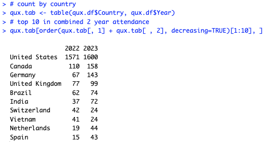
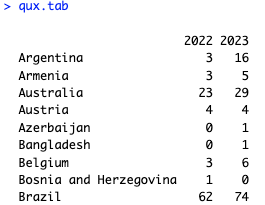
Next, let's ask: what were the Top 10 countries for attendees? To get that, we will first count the attendees by Country and Year using table(). Then we'll add the two years together for each country in that table — by adding the columns, which represent the years — and use order() to take the top 10. Here's the code:
# count by country
qux.tab <- table(qux.df$Country, qux.df$Year)
# top 10 in combined 2 year attendance
qux.tab[order(qux.tab[, 1] + qux.tab[ , 2], decreasing=TRUE)[1:10], ]
The answer is that the US had the most attendees by far, followed by Canada, Germany, the UK, Brazil, and India, as shown in the table:
We can also find the countries with the lowest attendance in the same way, just changing the call to order() so it is ordered increasingly (which is the default). I'll omit the result but here's the code:
# lowest attendance
qux.tab[order(qux.tab[, 1] + qux.tab[ , 2])[1:10], ]
In the next section, we'll visualize attendance by country.
Visualizing the Data by Country
As usual, data visualization takes a few steps. First, there is a long tail of countries that had few attendees, and plotting all of them would clutter the chart. Let's select only countries that had 8+ attendees in total. We can obtain that list by using the fact that our table() object includes rownames() that are useful and indexable:
# get countries with at least 8 attendees so we can select them later
whichCountries <- rownames(qux.tab[qux.tab[, 1] + qux.tab[ , 2] >= 8, ])
length(whichCountries)
That selects 44 unique countries with 8+ attendees. Next, I do some basic tidying of the data. I convert the countries and years to factor() variables so R will understand that they are not just letters or numbers, and I put the Country factor into reverse alphabetical order. I do that so the ggplot2 charts will read from the top down rather than the bottom up. Here's the code:
qux.df$Country <- factor(qux.df$Country,
                         levels=rev(sort(unique(as.character(qux.df$Country)))))
qux.df$Year    <- factor(qux.df$Year)
To set the reverse alphabetized Country names, I first convert the names to raw characters using as.character() (which they already would be unless I accidentally ran this line again after converting them to factors), get the unique() names, sort() them, and then reverse the sorted order with rev().
As I described in Part 1, it is helpful to use the log() of counts rather than raw counts. However, on a chart, axes that are labeled on a log scale can be difficult to read; ggplot2 might not choose the best label positions. Before plotting, I define a helper function logBreaks() that will give slightly better label positions:
logBreaks <- function(nint=10, ...) {
  function(x) {
    axisTicks(log10(range(x, na.rm=TRUE)), log=TRUE, nint=nint)
  }
}
This function tries by default to put 10 labels on the axis, using the entire range() of values, and does so on a log10() scale (which is easier to read than a natural log() scale). We'll see how this helper function is used in ggplot() in a moment. (BTW, it's perfectly OK not to have a helpful function like this, but it can make the chart easier to read, with less effort than manually specifying breaks in ggplot(). And I'll give a shout out to Heather Turner for this helpful StackOverflow answer that reminded me how to use axisTicks(). If you use someone's code, cite them :)
Here's the code to visualize attendance by Country, by Year:
library(ggplot2)
ggplot(data=subset(qux.df, Country %in% whichCountries), aes(x=Country, fill=Year)) +
  geom_bar(position="dodge") +
  geom_text(stat="count", aes(label=after_stat(count), color=Year),
            position = position_dodge(width = .9), hjust=-0.2, size=2.5) +
  scale_y_log10(breaks=logBreaks()) +
  xlab("Country (alphabetical)") +
  ylab("Attendees at Quant UX Con (axis is log scaled)") +
  theme_minimal() +
  coord_flip()
I'll comment on each line briefly:
For
ggplot(data=...), I select only thesubset()ofCountrythat we identified above as having 8+ attendees, compiled inwhichCountries.The
geom_bar()gives a bar chart (counts).In the bar chart, I
dodgethe bars so eachYearwill appear separately rather than stacked.geom_text()puts the observed counts — as computed ingeom_bar()and accessed withafter_stat(count)— at the end of each bar.scale_y_log10()rescales the axis to the logarithmic scale, and I tell it to get breaks suggested by thelogBreaks()helper function identified above.
Finally, I label the axes, remove some clutter with theme_minimal(), and coord_flip() the chart so the countries appear along the side rather than the bottom.
Here's the result, which shows attendance in alphabetical order by Country:
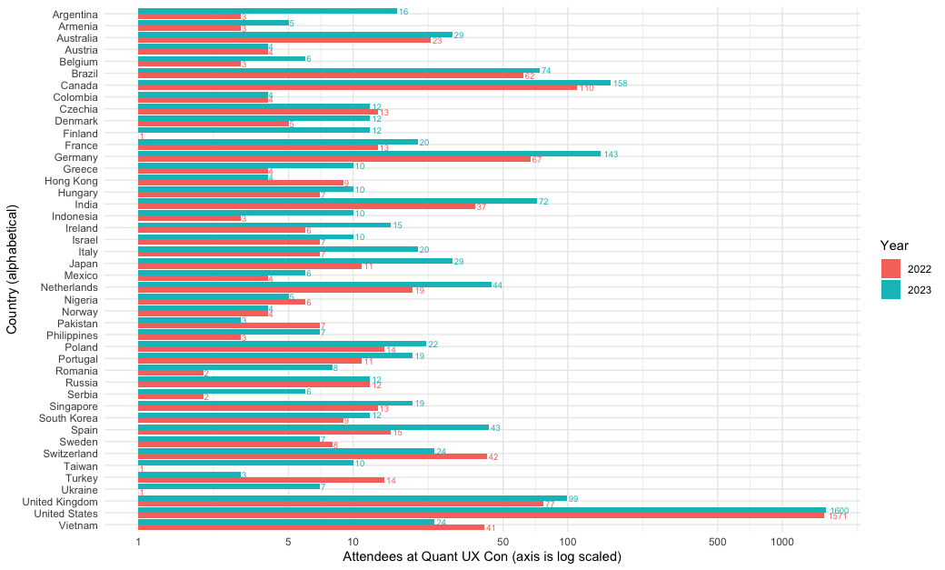
There are a few interesting points in the chart. First, the logBreaks() function gave readable labels on the 5s and 10s. The log scaling makes the individual countries more readable (I show the alternative raw scale below). Interestingly, we see that the growth from 2022 to 2023 was not driven by the US, where attendance was almost unchanged. Rather, attendance grew substantially in Europe, India, and other countries. (Why? Probably because Quant UX Con 2023 switched to a round-the-clock model that offered talks in all time zones instead of only US time!)
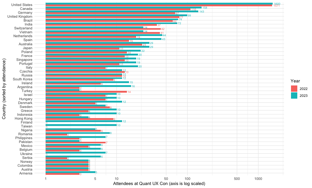
Although that chart makes it easy to find a particular country, it makes it difficult to compare them. Who had more attendees, Poland or France? Let's make a second chart sorted by overall attendance.
To do that, I use the forcats package and the helpful fct_infreq() function. That function sets the order of a factor ("fct") according to ("in") the frequency ("freq") of observations in the data set. Again, I use rev() — or in this case, fct_rev() to work on a factor variable — so that will read from the top down rather than the bottom up when plotted.
Here's the code. It is identical to the code above, except for using those factor functions to sort the axis:
library(forcats)
ggplot(data=subset(qux.df, Country %in% whichCountries),
       aes(x=fct_rev(fct_infreq(Country)), fill=Year)) +
  geom_bar(position="dodge") +
  geom_text(stat="count", aes(label=after_stat(count), color=Year),
            position = position_dodge(width = .9), hjust=-0.2, size=2.5) +
  scale_y_log10(breaks=axisBreaks()) +
  xlab("Country (sorted by attendance)") +
  ylab("Attendees at Quant UX Con (axis is log scaled)") +
  theme_minimal() +
  coord_flip()
The result is the following chart. We see that Poland barely topped France in attendance, with a total of 3 more attendees across the two years. In this chart, it is even easier to see that attendance went up from 2022 to 2023 for most countries. Hurrah to Spain, Japan, Italy, Argentina, Finland, Taiwan, Romania, Ukraine, and Serbia — among others — for the relative growth in interest!
I mentioned above that I'd show a chart with the raw values. Here is the same chart, sorted by attendance, but on a raw value scale instead of a log scale:
# same plot except NOT log-scaled
ggplot(data=subset(qux.df, Country %in% whichCountries),
       aes(x=fct_rev(fct_infreq(Country)), fill=Year)) +
  geom_bar(position="dodge") +
  geom_text(stat="count", aes(label=after_stat(count), color=Year),
            position = position_dodge(width = .9), hjust=-0.2, size=2.5) +
  scale_y_continuous() +                       # <== changed here
  xlab("Country (sorted by attendance)") +
  ylab("Attendees at Quant UX Con (axis NOT log scaled)") +
  theme_minimal() +
  coord_flip()
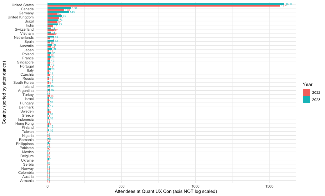
For stakeholders, I would usually show a raw value chart like this. Log axes are confusing to many people and I wouldn't want stakeholders to focus inappropriately on small differences. In that case, I would zoom in as needed by removing the US and perhaps other countries, in order to focus discussion as needed. But for myself and other analysts, the log-scale chart may be preferable.
The Counts Distribution
In Part 1, I mentioned that count data is typically distributed according to the inverse of frequency and a log() transformation often makes it more normal, i.e., Gaussian, in its distribution. Let's look at that for the Quant UX Con registrations.
First, we'll compute the total attendance by Country for the two years combined (of course you could do the same examination for each year separately):
qux.sum <- qux.tab[ , 1] + qux.tab[ , 2]   # total attendance
head(qux.sum)
The head() shows the first few countries' total counts:
Argentina Armenia Australia Austria Azerbaijan Bangladesh
19 8 52 8 1 1
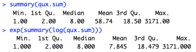
As we saw in Part 1, the geometric mean (exp(mean(log())) is much closer to the median than the arithmetic mean:
summary(qux.sum)
exp(summary(log(qux.sum)))
That gives the following. In the raw data, the mean and median are quite different, and the mean is far outside of the interquartile range (1st to 3rd quartile, i.e., the range from the 25th to 75th percentiles of the observations). In the log() transformed data, the mean and median are not so far apart.
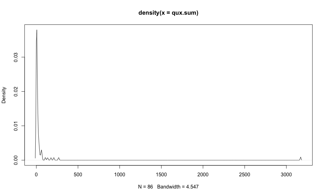
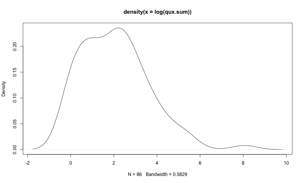
Next, I'll plot the raw and log() transformed distributions, smoothing them with a density() plot:
# density, raw values
plot(density(qux.sum))
# density, log frequency
plot(density(log(qux.sum)))
That gives the following two charts. We see again that the log() plot is much closer to a normal curve, but there is still a markedly elevated bump for the US.
In Part 1, I noted that counts data are often well-approximated by a Poisson distribution. Here's a bit more on Poisson distributions in R. The key parameter for a Poisson distribution is known as lambda, which is the mean of the observed counts on the logarithmic scale. If you specify the mean as being for 2 observations (log(2)), or 8.3 (log(8.3)), or 10.7, or 5000, or whatever, then the shape of the overall distribution is identified. You'll see below how I use the mean of the log() of observations for our data.
Comparing Observed vs. Random Counts
Given that mean-log, we can draw random possible values from a Poisson distribution using the rpois(N, lambda) (random poisson) function. For example, suppose our observed data has a geometric mean of 200 observations (see Part 1 for geometric mean). That would be a Poisson lambda of log(200), or 5.29. We could then draw random values using that value. For instance, rpois(10, 5.29) draws 10 random values from a Poisson distribution with a mean(log()) value of 5.29. On my system with the current .Random.seed value, that is:
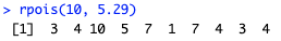
If we exponentiate that sequence and summarize it, we get the following:
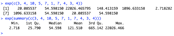
Those 10 random Poisson values ranged from counts of 3 to 22026 with a mean of 121.5. As we draw larger samples, we would see the values converge towards the stated mean of 200 (technically, 198 because I'm using 5.29 and exp(5.29) is 198). Here are some larger samples ranging from 1000 to 1M:
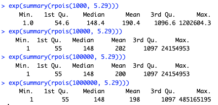
By the time we draw 1M samples, the mean converges on the specified value. (BTW, R can draw 1M random samples and summarize them on my Mac laptop in less than 0.05 seconds (!). FYI, you can time R code using the system.time() function.)
How do these random values help us? By drawing random values from the theoretical Poisson distribution — identified only by its mean value — and plotting those on top of observed data, we can see how closely our observed data fit the theoretical expectation.
Let's compare the observations and theoretical distribution for the Quant UX Con attendance values. First, I plot the density function for the observed attendance by country, using the log() transformation. Compared to the chart above, I slightly smooth the density line by increasing its bandwidth (bw=0.8 in the code; that affects the range of data used to smooth each part of the curve). I also set x- and y-axis limits, cutting the chart at x==0 because our observations start at a count of 1 (and exp(0)==1).
Here's the code, followed by the chart (I'll get to the "dashed" part in a moment):
plot(density(log(qux.sum), bw=0.8),
     ylim=c(0, 0.25), xlim=c(0, 10),
     main="Observed (solid) vs. theoretical (dashed) counts, Quant UX Con",
     xlab="Attendance (log scale)")
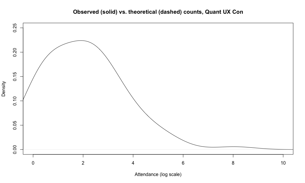
Again we see a fairly "normal" shape with an elevated tail at log()\==8 (the US).
Now let's add the theoretical Poisson distribution with the same log() mean as our data. We'll draw 10000 random values from the distribution using rpois() and then add the density() of those to the chart using the lines() function:
lines(density(rpois(10000, mean(log(qux.sum))), bw=0.8),
      col="red", lty="dashed")
Here's the final chart:
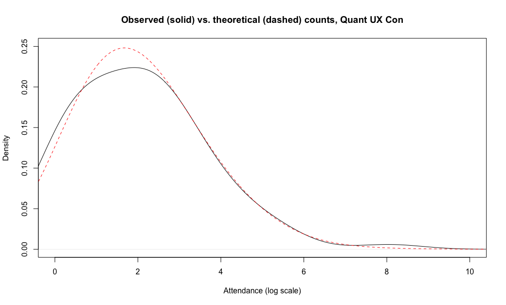
Interesting! The data fit the theoretical distribution almost exactly, in the range of about [2.7, 7.0] — which in raw numbers is the range of exp(c(2.7, 7.0)) or attendance of 15–1100 total attendees. The theoretical distribution would have expected more countries in the range of 2-15 attendees (0.7–2.7 on the log scale), and fewer countries with either 1 attendee (log=0) or 3171 attendees (log=8.06).
Put briefly, the Poisson distribution looks like a great fit for most of our observations, except that there appears to be something else affecting the tails of the distribution. (I'll comment more on that below.)
With that in place, let's take a look at Poisson regression for these data.
Regression Model for Counts by Country & Year
In Part 1, I described how to do a linear regression model with counts data, using the Poisson distribution. Now I'll repeat that for the conference attendance data.
First, I'd note that, although we technically can do regression with these data — modeling the attendance Count as a function of Country and Year — it's not very interesting. We already know that the countries vary and that attendance went up from 2022 to 2023. This is a case where descriptive statistics tell us almost everything we might want to know. We don't have enough years to fit any particular regression trends (see the "Additional Questions" section below).
However, if we had more years or other predictors (see below) then it would be interesting, and I think it's useful to model what we have to demonstrate a starting point. When you have the model working for these simple data, it's easy to apply it to other data.
Let's think through the data structure needed for regression. First, we want to model the count of attendance by country, by year, so we need counts. Those are in the table() object we made above, qux.tab. Here's an excerpt from that table:
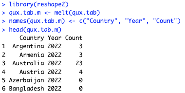
Second, we want the country. That's in the rownames() of the table. Finally, we want the year ... and that's in the table, except that there are 2 entries (years) for each row. We need to separate those into different observations — namely, an observation (row) for 2022 and another observation (row) for 2023. The melt() function in the reshape2 package can do that for us. (There are many other approaches; this is just one way.)
Here's the code:
library(reshape2)
qux.tab.m <- melt(qux.tab)
names(qux.tab.m) <- c("Country", "Year", "Count")
head(qux.tab.m)
The melt() function is short in this case, and then I update its resulting object names() to be more descriptive. That gives us the following, which has the Country, Year, and Count —exactly what we need to model the count by country and year:
The regression model is straightforward, remembering to use glm() and a Poisson distribution for the counts:
qux.lm <- glm(Count ~ Country + Year, data=qux.tab.m, family="poisson")
summary(qux.lm)
Inspecting the summary() of the model, we see effects for the various countries along with the year. Here's an excerpt:
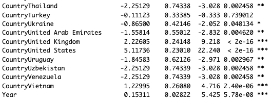
Poisson model coefficients are log values, so we can exponentiate them to get a rate of change. In this case, the Year coefficient is 0.1531, and exp(0.1531) is 1.16. So, on average, each country saw a 16% increase in attendance from 2022 to 2023. (It might make sense to use an interaction effect, where countries can differ in that rate; but for purposes here, we'll keep it simple. See the next section for more discussion.)
Remember how I said a regression model was not very interesting in this case? We already knew that there were N=2719 observations for 2023, up from N=2333 for 2022. The ratio of those is 2719 / 2333 = 1.16. There is nothing magical about regression! It all depends on the question you are asking. Very often, descriptive statistics and data visualization can answer our questions without "fancy" models.
In the next section, I'll look at other questions we might ask.
Additional Questions
The analyses above are a good starting point, and in practice, might answer many or most questions for a particular project. However, for further analysis and important projects, there are a variety of questions and possibilities to explore. Here are some notes and directions.
Countries are not all equal, so treating each country as "1 observation" is not optimal. A more complete model might include country-level covariates such as population, GDP, % of people speaking English (the conference language), employment or market capitalization of tech firms (largest employers of UXRs), etc. In the R book and the Python book, we discuss how to build regression models with covariates (Chapter 7).
The 2022 and 2023 conferences had different reach due to the differences in time zone coverage. With just two observations of
Year, we can't separate the time zone effect from the sequential year effect, so some analyses would require a longer time series. In that case, we could also consider the interaction of country and year; countries may vary in their trends from year to year.Many more observations are missing the
Countryvariable in 2023 (21% vs. 7%). That suggests doing a missing data analysis to see what's happening there. That might involve reviewing the data pipeline (in this case, Hopin and Stripe) to see whether some countries get filtered; doing covariate analysis (perhaps even propensity score analysis) to examine patterns; and perhaps applying some kind of data imputation method.As noted, the Poisson distribution is an excellent default for count data, but we could consider more precise options for the distribution. Some possibilities include zero-truncated Poisson and zero-inflated negative binomial distributions. Another would be a Poisson mixture model, where some countries such as the US have a separate distribution. An R package with many additional distributions for such data is the
actuar(actuarial analysis) package.
Personally, I would start with the missing data question in #2 above — data quality always comes first — and then examine covariates in #1 above, and then consider question #4 about the appropriate distribution.
Learning More
Compared to the first post, this post had a lot more R code. My R book with Elea Feit can help you learn more about R. In particular, Sections 4.2, 5.2, and 9.2 deal with categorical data similar to what we've seen in this post.
As I mentioned in Part 1, the regression model described here does not appear in the R book, so this post adds to the book (although the book has much more about regression models in general!) I view these blog posts as being like "extra chapters" for the Quant UX book, the R book, and the Python book.
Finally, I'll call out the best source for the mathematical details and statistics for categorical data of all types (of which counts are an example): Agresti's Categorical Data Analysis (2012).
All the Code
Here is one block with all of the R code from this post. Cheers!
# (c) 2023 Chris Chapman, quantuxblog.com
# Reuse is permitted with citation: Chapman, C (2023), Quant UX Blog.

# data set
qux.df <- read.csv(url("https://quantuxbook.com/misc/quantuxcon_2022_2023_countries.csv"))
str(qux.df)

# number of unique countries
length(unique(qux.df$Country))
# count of attendees by year
table(qux.df$Year)

# count by country
qux.tab <- table(qux.df$Country, qux.df$Year)
# top 10 in combined 2 year attendance
qux.tab[order(qux.tab[, 1] + qux.tab[ , 2], decreasing=TRUE)[1:10], ]

# lowest attendance
qux.tab[order(qux.tab[, 1] + qux.tab[ , 2])[1:10], ]

# get countries with at least 8 attendees so we can select them later
whichCountries <- rownames(qux.tab[qux.tab[, 1] + qux.tab[ , 2] >= 8, ])
length(whichCountries)

# slightly tidy the data for plotting
qux.df$Country <- factor(qux.df$Country,
                         levels=rev(sort(unique(as.character(qux.df$Country)))))
qux.df$Year    <- factor(qux.df$Year)

# plot frequency by country and year
# helper function for prettier break values
logBreaks <- function(nint=10, ...) {
  function(x) {
    axisTicks(log10(range(x, na.rm=TRUE)), log=TRUE, nint=nint)
  }
}

# plot in alphabetical order
library(ggplot2)
ggplot(data=subset(qux.df, Country %in% whichCountries), aes(x=Country, fill=Year)) +
  geom_bar(position="dodge") +
  geom_text(stat="count", aes(label=after_stat(count), color=Year),
            position = position_dodge(width = .9), hjust=-0.2, size=2.5) +
  scale_y_log10(breaks=logBreaks()) +
  xlab("Country (alphabetical)") +
  ylab("Attendees at Quant UX Con (axis is log scaled)") +
  theme_minimal() +
  coord_flip()

# plot sorted by observed count
library(forcats)
ggplot(data=subset(qux.df, Country %in% whichCountries),
       aes(x=fct_rev(fct_infreq(Country)), fill=Year)) +
  geom_bar(position="dodge") +
  geom_text(stat="count", aes(label=after_stat(count), color=Year),
            position = position_dodge(width = .9), hjust=-0.2, size=2.5) +
  scale_y_log10(breaks=axisBreaks()) +
  xlab("Country (sorted by attendance)") +
  ylab("Attendees at Quant UX Con (axis is log scaled)") +
  theme_minimal() +
  coord_flip()

# same plot except NOT log-scaled
ggplot(data=subset(qux.df, Country %in% whichCountries),
       aes(x=fct_rev(fct_infreq(Country)), fill=Year)) +
  geom_bar(position="dodge") +
  geom_text(stat="count", aes(label=after_stat(count), color=Year),
            position = position_dodge(width = .9), hjust=-0.2, size=2.5) +
  scale_y_continuous() +                       # <== changed here
  xlab("Country (sorted by attendance)") +
  ylab("Attendees at Quant UX Con (axis NOT log scaled)") +
  theme_minimal() +
  coord_flip()

# compare raw and geometric means of total attendance
qux.sum <- qux.tab[ , 1] + qux.tab[ , 2]   # total attendance
head(qux.sum)
summary(qux.sum)
exp(summary(log(qux.sum)))

# density, raw values
plot(density(qux.sum))
# density, log frequency
plot(density(log(qux.sum)))

# log density plot with rpois data
plot(density(log(qux.sum), bw=0.8),
     ylim=c(0, 0.25), xlim=c(0, 10),
     main="Observed (solid) vs. theoretical (dashed) counts, Quant UX Con",
     xlab="Attendance (log scale)")
lines(density(rpois(10000, mean(log(qux.sum))), bw=0.8),
      col="red", lty="dashed")

# regression model
# set up data in long format so year is an "observation"
library(reshape2)
qux.tab.m <- melt(qux.tab)
names(qux.tab.m) <- c("Country", "Year", "Count")
head(qux.tab.m)

# model
qux.lm <- glm(Count ~ Country + Year, data=qux.tab.m, family="poisson")
summary(qux.lm)