Intro to the Van Westendorp Pricing Exercise

A popular — and yet in my opinion not popular enough — method to investigate pricing is the Van Westendorp Price Sensitivity Meter (I'll call it "VW PSM").
The VW PSM is a fast and simple way to investigate perceptions of pricing. I'll show how it works, with R code, and describe its strengths and weaknesses.
Overall, I find the VW PSM to be very useful ... as long as you do not interpret it as "willingness to pay" (WTP). VW PSM is not WTP, but it complements other methods such as conjoint analysis. In any case, VW PSM is a big improvement over the rudimentary approach of asking only a single item, "How much would you pay?"
The Items & Basic Concept
The data for VW PSM comes from 4 numeric, open response items. I usually ask them in this order (adapting the exact wording as needed):
If you were purchasing XYZ today, at what price would you say it is both a reasonable price and also a good deal?
... at what price is XYZ starting to get expensive, but you would still consider it?
... at what price is XYZ too expensive, and you would not consider it?
... at what price is XYZ too cheap to be believable, and you expect it to be low quality?
Let's imagine we're pricing a rechargeable bike helmet 2-way radio. A hypothetical respondent might say that $80 is a reasonable price and a good deal; $100 is starting to get expensive; $150 is too expensive; but less than $50 is too cheap to be credible. (BTW, I don't know anything about the bike radio market; I'm making up the data here. If the data seem unreasonable to you, pretend it's a different product.)
The VW PSM method works by plotting four curves — the cumulative distributions of each of those 4 values — by price, to find the range of prices where most respondents say a product is not too expensive and also not too cheap. Let's take a look at how that works!
PSM Analysis: Set Up
First, we'll load the hypothetical "bike helmet radio" data. Usually this would come from importing a data set ... but for simplicity here, I've hard-coded it directly into R (thanks, datapasta package!) In this data frame, we have responses to each of the 4 questions as asked above (and in the same order). Specifically:
Good deal ... becomes the variable
cheapStaring to get expensive ... is
expensiveToo expensive ... is
tooexpensiveToo cheap ... is
toocheap
Here is an R code snippet for the data; as always, you can find a complete set of all the R code at the end of this post.
(BTW, it's possible to do VW PSM without using R — see here, or search for "van westendorp excel" — but really, why would anyone not want to use R? LOL.)
# complete data (hypothetical; N=12)
vw.dat <- data.frame(
            id = c(1L, 2L, 3L, 4L, 5L, 6L, 7L, 8L, 9L, 10L, 11L, 12L),
         cheap = c(120L,50L,50L,40L,250L,200L,125L,199L,50L,150L,149L,100L),
     expensive = c(150L,150L,150L,100L,350L,450L,200L,129L,80L,300L,250L,300L),
  tooexpensive = c(250L,250L,300L,250L,500L,600L,300L,199L,100L,500L,450L,400L),
      toocheap = c(40L, 25L, 25L, 15L, 25L, 50L, 50L, 29L, 0L, 99L, 75L, 50L)
)
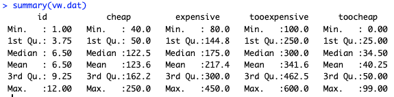
summary(vw.dat)
In the summary(), we see that the median "good deal" (cheap) is $122, and so forth:
However, what is more interesting than summary statistics is the distribution of answers. Here's a distribution for the "too expensive" answers.
# plot one ecdf (empirical cumulative distribution function)
plot(ecdf(vw.dat$tooexpensive))
This code uses the R ecdf() function (empirical cumulative distribution function) to find the proportion of responses that are at or below a particular value. The resulting chart is the following:
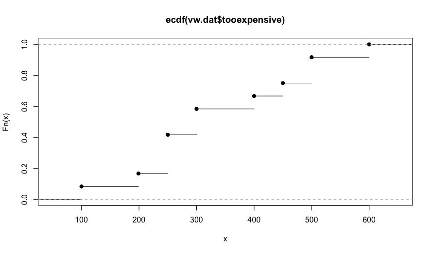
In this chart, we see that no one reported that our radio would be too expensive until it costs $100. By the time the price reaches $450, about 75% of respondents say it is too expensive to consider (reading the Y axis).
In the next section, we add the distributions for the other 3 answers (good deal aka cheap, expensive, and too cheap) and see how those intersect in VW PSM analysis.
PSM Analysis: Complete
The R package pricesensitivitymeter makes VW PSM analysis simple. In a nutshell, you feed your data into the psm_analysis() function, save those results as a model object, and plot them with psm_plot(). Let's dive in!
First, we fit the model and save the results to a model object that I call psm:
# Van Westendorp analysis
library(pricesensitivitymeter)

# fit the VW model
psm <- psm_analysis(toocheap     = vw.dat$toocheap,
                    cheap        = vw.dat$cheap,
                    expensive    = vw.dat$expensive,
                    tooexpensive = vw.dat$tooexpensive,
                    validate = FALSE, interpolate = TRUE, intersection_method = "median")
In the call to psm_analysis(), I set a few options that I prefer. You can decide on those for your particular problem; see that function's help page. I also prefer to hard code the alignment when calling psm_analysis() between the 4 VW PSM parameters and my individual columns — as shown in the code above — as a double check.
When you run the function with the current data set, you'll be warned that "Some respondents' price structures might not be consistent". I discuss that in the "Assumptions & Problems" section below. Meanwhile, you might be interested to identify those respondents:
# which respondents fail the consistency check?
with(vw.dat, which(cheap <= toocheap | expensive <= cheap | tooexpensive <= expensive))
In these data, row 8 is inconsistent. With that, you can decide what to do (see the "Problems & Assumptions" section below).
After fitting the model, the main result is a plot of the 4 distribution curves. The code is simple — just psm_plot(psm) — although I add some options to clean it up:
# plot it
# set a price axis tick label interval, and maximum price to plot
scalebin <- 40
scalemax <- scalebin * (round(max(psm$data_vanwestendorp$price) / scalebin) + 1) # set up scale for $[scalebin] increments
# OR, if you want to trim the X axis, just set a maximum directly
scalemax <-300

psm_plot(psm) +
  scale_x_continuous(breaks=0:(scalemax/scalebin)*scalebin) +
  coord_cartesian(xlim=c(0, scalemax)) +
  theme_minimal() +
  ylab("ECDF") +
  xlab("Price ($)") +
  ggtitle("Price Expectation, Hypothetical Product (N=12)")
In the first lines above, I set a "bucket size" for the labels on the X axis (scalebin). Then I choose a maximum value for the X axis from the fitted model (scalemax) ... but I override that on the next line. You'll want to use only one of those two lines.
The psm_plot() function returns a ggplot2 objection, so we can add ggplot options. I trim the X axis, add breaks to match the scalebin choice, and add labels.
Here is the resulting plot:
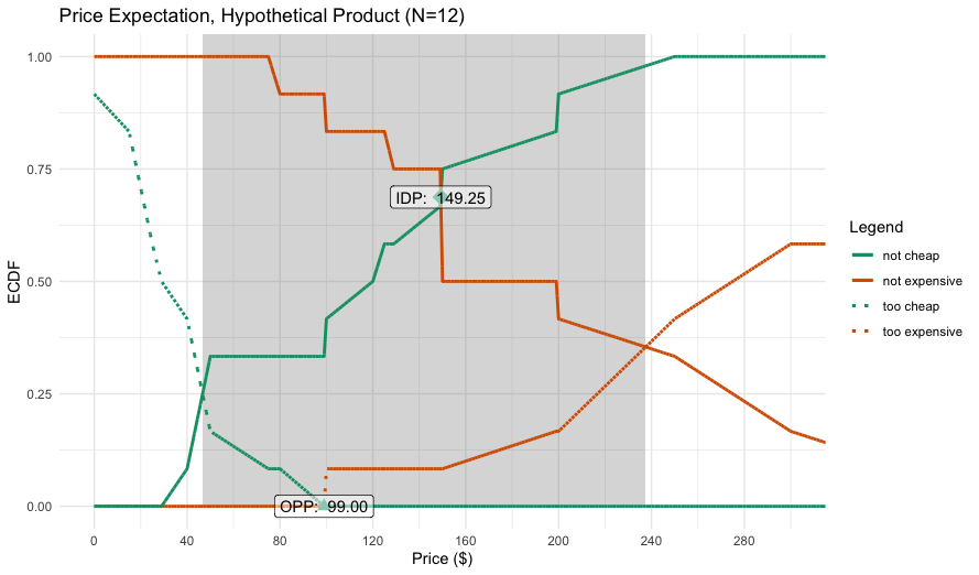
Let's interpret the results one step at a time:
The inner shaded area is the range of reasonable prices, defined (by default) by a lower and upper point of intersection of the curves. In this case, the range of reasonable prices is $46–$237 (inspect the
psmobject for the exact values).At the lower price end, the reasonable price range begins where the observed proportions for not cheap and cheap (good deal) intersect. Below that point, many respondents believe the product is too cheap, and most would pay more.
At the upper end, the reasonable range ends where not expensive and too expensive intersection. Above that, many respondents would stop considering the product.
The model identifies two candidate points for the best price: the so-called indifference point (IDP) and optimal price point (OPP). I do not interpret those as "willingness to pay" or "optimal price" or anything like that. Instead, I interpret them as defining the perceived range of the most-expected (and reasonable) prices. They express perceptions, not willingness to take action. In this case, theperceived range of expected prices for our radio is $99–149.
[Technical side note] The VW PSM plot inverts some of the ECDF curves to be more interpretable (plotting the proportion below a particular value, i.e., 1-ECDF). You can ignore thinking about that; or see the references for details.
With stakeholders, I share the VW PSM chart and interpret it as above. I explain that the chart tells us what respondents expect the price range to be, and what the reasonable price boundaries are ... according to the understanding that respondents have, and relative to what we tested.
If our product's pricing plan falls outside of the VW PSM ranges, then we need to do additional thinking, marketing, or research to understand the disconnect with respondents' perceptions. (BTW, it often happens that respondents expect a product to be priced higher. That is good to understand!)
I also explain to stakeholder that we would need additional data — such as a conjoint analysis or other market experiment — to assess the actual purchase likelihood. In my opinion, PSM is primarily a perceptual assessment.
Assumptions & Problems
Briefly, some assumptions of the VW PSM method are:
... that respondents understand the product you're asking about.
- Details. PSM is most appropriate for mature, well-understood products — and asking about full product prices, not incremental costs (unless those are also well understood). However, as I note in the recommendations section below, it can be informative for new products as well.
... that they can answer the questions. In person pre-testing is always advisable!
... that their answers will be consistent, for instance that their values of "expensive" will be higher than those for "cheap".
Typical problems are:
Inconsistency. PSM survey responses often fail the assumption of being correctly ordered, and you have to decide what to do about them.
- Details. I typically include such data ... but only if it is a small proportion of respondents. One thing I never do is to force responses into logical sequence using survey validation logic. You want to detect inconsistency, not impose false consistency onto raw data! (In my code above, the option
validate=FALSEtells thepsm_analysis()function to use all data, and it warns you when there are problems detected.)
- Details. I typically include such data ... but only if it is a small proportion of respondents. One thing I never do is to force responses into logical sequence using survey validation logic. You want to detect inconsistency, not impose false consistency onto raw data! (In my code above, the option
Lack of understanding. As noted above, the product has to be something that respondents understand well enough that they have a price "in their heads."
Ranges that are too large (or too narrow) to be useful to a business. Later authors have added modifications that partially help with this (see discussion in the
pricesensitivitymeterpackage documentation).Respondent negotiation. Because VW PSM items are transparently about price, respondents may lowball their answers in hopes to depress pricing.
- Details. In my experience, I have not observed much of that; results often mirror market realities. But if we view VW PSM as a perceptual exercise, then such negotiation is still an informative and interesting signal about respondents' perceptions.
General data quality. Speeding, bots, bad samples, etc., are always a problem.
In practice, the most common problem I see is this: researchers often field a PSM study without pre-testing it. Before fielding, ask 2-4 people — not from the product team — to take your PSM survey live and discuss their answers!
The second most common problem is when researchers interpret a VW PSM result as being about willingness to pay or a behavioral intent. IMO, it is not. I view VW PSM as a perceptual measure about what respondents expect.
Recommendations & Learning More
Overall, I think the Van Westendorp PSM method is a great addition to a Quant UX and Quant Marketing toolkit. However, it must be used judiciously. In particular:
If you are asking respondents a single item, "How much would you pay?" ... don't. VW PSM (or conjoint analysis) is much better than that.
VW PSM is easy to administer and informative for initial pricing exploration. It takes much less respondent time than conjoint analysis, and can be administered easily in any survey platform or form.
The results should be viewed as exploratory and perceptual in nature. They do not establish "willingness to pay" but tell you how respondents think about a reasonable price range for your product or service.
You can add stated purchase intent to VW PSM (the "Newton-Miller-Smith extension"; see the R package reference) but I typically use conjoint analysis instead. Conjoint estimates are better than simple statements of purchase intent.
Although VW PSM works best with established, mature product categories, it can be helpful with new products for an initial read about expected price perceptions. Interpret it as a signal about consumer understanding.
VW PSM has several limitations as noted above. If you have many respondents with confused and inconsistent data, then something may be wrong with your survey. (The good news is that the method provides such diagnostic information!)
Ideally, pricing research will use several methods together, such as VW PSM for expectations, plus conjoint analysis to estimate expected choices, plus market data. With triangulated data, we can be more confident.
If you're doing conjoint analysis, VW PSM is an easy and quick way to cross-check your conjoint analysis results.
To learn more about VW PSM and pricing research more generally, see:
[Original VW PSM paper]
Van Westendorp, P (1976). "NSS-Price Sensitivity Meter (PSM) – A new approach to study consumer perception of price" Proceedings of the ESOMAR 29th Congress, 139–167. Available at https://archive.researchworld.com/a-new-approach-to-study-consumer-perception-of-price/[R package reference]
Alletsee, M (2024). pricesensitivitymeter: Van Westendorp Price Sensitivity Meter Analysis, v1.3. https://CRAN.R-project.org/package=pricesensitivitymeter.[Comparison of VW PSM and Conjoint Analysis]
https://sawtoothsoftware.com/resources/blog/posts/conjoint-analysis-pricing-research[Introduction to Conjoint Analysis]
Chapman, C, and Feit, EM (2019). Chapter 13 in the R book.[Reference for many pricing methods]
Rao, VR, ed. (2010). Handbook of Pricing Research in Marketing. Elgar.
I hope you'll give VW PSM a try ... preferably alongside a second method such as conjoint analysis whenever possible. Cheers!
R code
All of the R code from this post is here. You can use the "copy" button in the upper right to grab it and then paste into RStudio or your favorite editor.
# Van Westendorp analysis for blog
# Citation: Chris Chapman (2024). "Van Westendorp Pricing" at the Quant UX Blog, https://quantuxblog.com.

# complete data (hypothetical; N=12)
# note that the long numeric suffix is added by datapasta (data came from a Libre Office spreadsheet)
vw.dat <- data.frame(
            id = c(1L, 2L, 3L, 4L, 5L, 6L, 7L, 8L, 9L, 10L, 11L, 12L),
         cheap = c(120L,50L,50L,40L,250L,200L,125L,199L,50L,150L,149L,100L),
     expensive = c(150L,150L,150L,100L,350L,450L,200L,129L,80L,300L,250L,300L),
  tooexpensive = c(250L,250L,300L,250L,500L,600L,300L,199L,100L,500L,450L,400L),
      toocheap = c(40L, 25L, 25L, 15L, 25L, 50L, 50L, 29L, 0L, 99L, 75L, 50L)
)
summary(vw.dat)

# plot one ecdf (empirical cumulative distribution function)
plot(ecdf(vw.dat$tooexpensive))

# Van Westendorp analysis
library(pricesensitivitymeter)

# fit the VW model
psm <- psm_analysis(toocheap     = vw.dat$toocheap,
                    cheap        = vw.dat$cheap,
                    expensive    = vw.dat$expensive,
                    tooexpensive = vw.dat$tooexpensive,
                    validate = FALSE, interpolate = TRUE, intersection_method = "median")

# which respondents fail the consistency check?
with(vw.dat, which(cheap <= toocheap | expensive <= cheap | tooexpensive <= expensive))


# plot it
# set a price axis tick label interval, and maximum price to plot
scalebin <- 40
scalemax <- scalebin * (round(max(psm$data_vanwestendorp$price) / scalebin) + 1) # set up scale for $[scalebin] increments
# OR, if you want to trim the X axis, just set a maximum directly
scalemax <- 300

psm_plot(psm) +
  scale_x_continuous(breaks=0:(scalemax/scalebin)*scalebin) +
  coord_cartesian(xlim=c(0, scalemax)) +
  theme_minimal() +
  ylab("ECDF") +
  xlab("Price ($)") +
  ggtitle("Price Expectation, Hypothetical Product (N=12)")

About the author
- President, Quant UX Association. Previously: Principal UX Researcher @ Google; Amazon Lab 126; Microsoft. Author of "Quantitative User Experience Research" and "[R | Python] for Marketing Research and Analytics".
Comments
Join the discussionHi Chris, thank you so much for this article. It's been really helpful. What would you recommend as a next step if the pricing curves don't intersect at all and you're not able to send out more survey questions to the audience? How do you interpret the information and can you supplement it with another tool?
You're welcome and I'm glad it was useful. The VW model here has various problems and limitations and it is not unusual for the lines to be strange or not to cross. The main point is that VW is more of a semi-qualitative tool about stated expectations than a rigorous quantitative assessment. It is sensitive to exact wording and sample understanding.
My recommendation in that case is to describe the lines of interest with summary stats such as the median or other percentile. For example, we might report something like "50% of the sample believed $50 was too cheap, and 75% would consider it at $100." That can accomplish similar insight while staying with the data we have.
As for supplementing with another tool, if you can get more sample then I'd recommend conjoint analysis and/or a "monadic pricing" approach. If you can't get more sample, then I would go with summary stats as noted above. HTH!
thank you Chris ! appreciate it Chris Chapman