Misconceptions about Conjoint Analysis

Choice-based conjoint analysis (or "conjoint" for short) is an astonishingly powerful survey method. Conjoint can help determine the value of a product's features, find respondents' price sensitivity, and identify interested customer segments.
I've written separately about how well conjoint performs to determine product preference (short answer: very well, assuming you "tune" it across a few iterations). Besides product optimization and pricing, conjoint can even be used to find optimal product portfolios or create attitudinal consumer profiles (aka segments or personas).
Briefly, the power of conjoint is that it mimics a real shopping process, while using randomization and forced tradeoffs to determine what matters most to customers.
But this post is not an introduction to conjoint analysis; I assume that you are at least generally familiar with it. For an introduction, see any of these:
This introduction by Sawtooth Software
A webinar where I discussed applications of conjoint with Eric Bradlow of the Wharton School
For technical details, check out Chapters 9 and 13 in the R book, or Chapter 8 of the Python book.
My goal in this post is to illustrate a few ways in which conjoint may be misunderstood. These are based on a past talk about things clients get wrong about conjoint analysis.
Mistake #1: Conjoint will Estimate a Market Share
Conjoint analysis is routinely used to determine the "preference share" for one product vs. another (or many others). The problem is that preference share sounds so much like market share that the two are routinely confused by stakeholders.
As a refresher, a product's estimated preference share is determined by adding up the conjoint "utility values" for its features, and then dividing the exponentiated (e^) total by the total sum across it and competing products. This table shows an example:
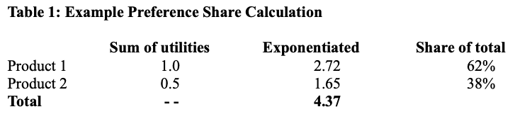
Stakeholders often read that as, "Product 1 will get 62% relative market share!"
The problem with this is that market share is influenced by many factors that are not captured in conjoint analysis. Those include:
Product awareness and availability in consumers' shopping channels
Features and competitors that were not tested in the conjoint analysis
Changes in the ecosystem since the conjoint analysis was conducted
Sample adequacy and projection to the market
Other behavioral effects such as regret minimization (where a consumer purchases a product that is least likely to be regretted, even if it not necessarily the most preferred)
Those factors do not mean that conjoint analysis is useless. Conjoint analysis is used to assess preferences, and preferences are highly correlated with sales. But they are not identical to sales.
To improve this misunderstanding:
Say that conjoint assesses the relative preference of products and features, under the assumption that other factors are all equal
It is possible to tune those results to more closely approximate market share — if that is the goal — but that requires various other inputs and iterative improvement.
In short, I always talk about "relative share of preference" unless I have strong evidence and specific intent to assess market share.
Mistake #2: Conjoint Gives Simple Pricing Data
An almost universal motivation for conjoint analysis is to get insight on pricing. It can estimate the value of various features, and how that value compares to the product cost. In other words, we want it to answer, "How much can we charge?"
Conjoint delivers tremendous information to inform pricing decisions, but conjoint does not directly answer, "How much can we charge?" or "How much is this feature worth?"
There are several factors that go into using conjoint data for effective and accurate pricing. One is the necessity to do iterative tuning as I noted above in Mistake #1.
Another factor is that the connection between a pricing curve and feature values must be set by an analyst— using both economic theory and category knowledge. There is no single "right way" to map prices to preferences. Conjoint modeling and observed data must be combined with other knowledge.
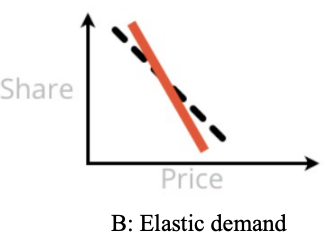
To illustrate this, let's look at three common pricing patterns that arise when we attempt to estimate product demand (aka preference) using conjoint data.
Pattern A is shown below. In pattern A, the expected preference share (aka demand) decreases slowly as prices increase, such that it falls more slowly than the rate of price increase. Economists say the demand is "inelastic".
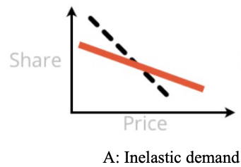
Stakeholders love to see Pattern A because it says, "Price it high!" The takeaway is that demand will drop as prices go up, but we'll more than make up for it in profit. (This strategy assumes that our goal is revenue or profit, not market share.)
Pattern B is next. In Pattern B, demand falls rapidly with prices, and the optimal point for demand and revenue (and perhaps profit) is to price low. This reflects "elastic" demand. Stakeholders may either love or hate Pattern B, depending on their business goal.
Finally there is Pattern C. Pattern C presents a U curve — demand falls in part of the price curve but rebounds at the end (there is also an inverted version but it seems to be less common). Pattern C says, "Either price low or price high!" ... and stakeholders always love this pattern.
A frequent comment is, "Of course! If we price high, customers will think the product is better and they will want it more!"
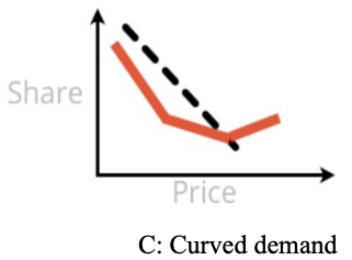
Unfortunately, at least 2 of these 3 curves (and sometimes all 3) may be produced from the same observed conjoint data! They are not so much a reflection of the data as much as a combination of observed data plus statistical modeling assumptions.
In the next section, I look closely at how that works, and why Pattern C (in particular) is deceptive.
Deep Dive on Mistake #2 and Pattern C
This section is a bit long, as it dives into understanding how Pattern C arises. But I hope you'll find it interesting and useful to think more rationally about pricing.
Let's drill in on the statement above that conjoint results reflect data + assumptions. Pattern C — which shows U-shaped demand across price points — may arise when a conjoint analysis uses "piecewise estimation" for the demand at different price points. That means that each price point is estimated separately without an assumption of an overall linear pattern.
At first that sounds very reasonable. It seems like we should look at the demand at each price point, without prematurely forcing a linear pattern onto the prices and demand. That would let us discover something about customers, right?
The problem is this: a core assumption in conjoint analysis is that "all other factors" — meaning, factors not included in the survey or modeled in the analysis — are constant and do not influence the estimates. However, the post-hoc explanation of Pattern C typically violates that assumption — it imagines that there is another factor influencing respondents' perception of price.
Here's a simple way to see that. Let's suppose that Pattern C is true, such that demand for our product increases as price goes up, in some part of the demand curve. That would imply the following:if you offer someone the chance, they would prefer to pay more, not less!
Here's one example:
"Thank you, I see you'd like to purchase this iPad for the listed price of $699. But you would actually prefer to pay $799 instead, right?"Or another:
"We need to clear out last year's model from the warehouse inventory. So let's cancel the sale. Raise the price instead!"
It is irrational to believe that pricing would ever behave this way.
Instead, what is usually happening with Pattern C is this: prices are associated with brands, and the higher-priced brands are associated with higher quality or other desirable factors. Because of that, higher priced brands have relatively higher demand than we would otherwise expect from their features. This shows up in conjoint results as an artificial "bump" at higher price points.
Customers may have structurally different price curves for different brands ... but if you want to claim that as an analytic result, it should be modeled. That might be done, for example, by including an interaction effect for BRAND:PRICE (see the side note below for more). However, by default, conjoint analysis models use main effects models and therefore do not estimate such interactions at an aggregate level.
To the specific point of Pattern C, we should never expect demand to increase simply because a price increases. If that effect occurs, there must be some other factor going on ... and to make systematic claims about it, that factor should be modeled.
The key point is this: naive interpretations of pricing from conjoint analysis are almost always wrong, especially when they are a delightful "surprise". Price estimation depends on several assumptions that must be considered carefully.
Side note (even deeper brief dive): Bryan Orme of Sawtooth Software wrote to me to discuss when one needs to specify interaction models with hierarchical linear models (which are typically used in conjoint analysis). Bryan noted that when one uses lower-level estimates from hierarchical Bayes models, it is not generally necessary to specify interaction effects. Per-respondent differences in brand preference and price sensitivity will appear in the individual-level estimates and can be used in preference simulation and other analyses.
For my part, I agree although I place emphasis on a different part of the statistical model: the specified regression model itself and the assumptions that go into it. (See the R book Chapter 13 for more on the models.) In the example here, if we wish to claim that brands have differences in the shape of their price sensitivity curves, we should model that assumption and test it statistically. There is a middle position where we might discover such effects in individual-level estimates and then consider whether to model them later.
In either case, I'm not saying that one should always include brand interactions. There are good reasons to start with main effects models as a default. Rather, my point is that one should understand a model's structure and not read post-hoc explanations into its results. As a practical matter, I usually avoid Pattern C by imposing monotonic constraints on price estimation ... which is an assumption that goes into the model (and a longer topic on its own).
Thank you, Bryan, for the discussion! Readers: check out Bryan's book with Keith Chrzan below.
To use conjoint for successful pricing research, you need repeated observations to understand how prices work for your category, product, market, and brand. That requires iterative data, attention to the results, and rational modeling of effects.
Again, this doesn't mean that conjoint analysis is wrong or useless, or shouldn't be used for pricing. It is only to say that conjoint results must be reviewed rationally. Results should not be accepted simply because they tell a good story like Pattern C.
Mistake #3: Highest Preference == Best Product
A third confusion I've seen is when stakeholders believe that the best product decision is to offer the most-preferred feature(s) from a conjoint survey. At first that sounds very reasonable, no? Of course we should offer the most-preferred options.
Let's take a look at a fictional example. Suppose we're making USB keys at various price points, in various sizes, with different colors. Conjoint might give us results like the following fictional data. (In this chart, blue circles represent each respondent's preference for a feature; red is the average of respondents; and higher preference for each feature is at the top.)
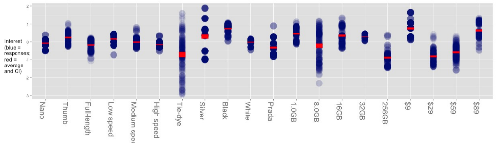
Looking at the average interest (in red), we see that the highest-scoring USB key would have a thumb form factor, black color, 1GB of memory, and cost $9. (Remember, these are fake data; they may be unrealistic.)
However, that simple reading of the data assumes two things: (1) that such a combination is possible for engineering, and (2) that there is no competition! The first assumption is generally obvious to teams, but the second assumption is frequently overlooked.
When we consider competition, the picture may change dramatically. Suppose all of the existing USB keys are already black. Our [fake] results show a subset of customers who are highly interested in silver — more than any customer is interested in black. That gives us an opportunity to address a highly-interested subset of customers with a differentiated product.
The same is true for tie-dye color — the average interest is the lowest of any color but there are a few fans. If we are able to reach them, that could be a great product choice. Similarly — assuming we believe it; see mistake #2 above — there are customers who are open to paying more in the $89 preference column, and there could be an opportunity for a "higher design," more luxurious brand.
All of those possibilities open up once we look at the distribution of customer interest, and how the diversity of customer interest maps to competition and to our own business strategy. If we reach a subset of customers with differentiated interest, we may have a great business, even if the "average interest" is low.
Again, the point is not that conjoint answers are incorrect, but that conjoint delivers much more information than a superficial reading. In this case, the results point to many potential actions and strategic possibilities beyond simply making "the feature of highest interest."
For More
To learn more about the basics of conjoint, see the "introduction" references at the start of this post.
To go beyond those, I also recommend:
A complete whitepaper that adds several more examples and "mistakes" to the ones here: 9 Things Clients Get Wrong About Conjoint Analysis.
A great book that goes beyond the basics into intermediate and advanced practice of conjoint analysis, from the experts at Sawtooth Software: Orme & Chrzan: Becoming an Expert in Conjoint Analysis.
The conferenceAnalytics and Insights Summit, where practitioners and academics present the latest developments in choice modeling (among other topics).
I hope this post inspires you both to use conjoint analysis ... and to improve how your stakeholders understand it!